BELLA PILAR

BellaPilar_72

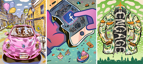
A city girl with a rich imagination and deep talent, Bella Pilar moved from hometown New York to Sunny Los Angeles where she follows her passion for painting. Her whimsical, feminine artwork takes a traditional rendering style and pushes it to a pretty new place with fashionable and fanciful ladies who lunch, live life and take flight in artwork that is as fresh and fun as it is inspiring. Trained in fine art and fashion, her ties to the world of style began with a career in the fashion and beauty industry before diving into art, her true love. A prolific artist, Bella now brings her signature style to life with paint and brushes. Her artwork has wide appeal, appearing in advertising, books, magazines, and for fashion and beauty companies and retailers.

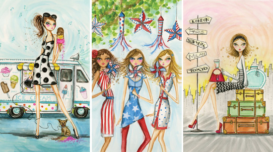
PERSONAL WORK BP_PersonalWorkABOVE: Personal work
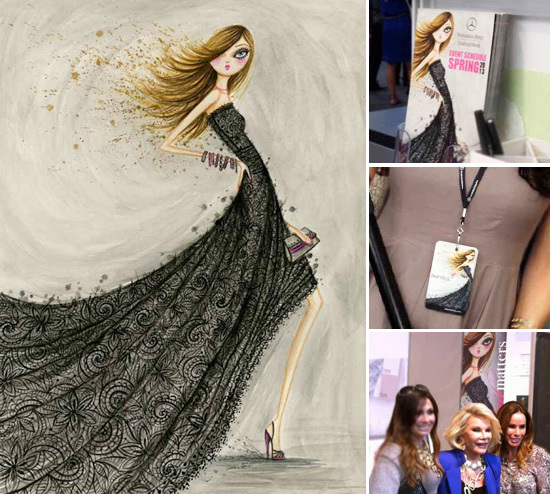
Fall 2012 saw a career-defining moment for Bella when she was tasked with creating the event artwork for Mercedes-Benz Fashion Week in New York City. With long-time client Papyrus as a proud supporter of the week-long fashion event, Bella's luxe fashionistas appeared on press passes and the cover of the show schedule. A select few of Papyrus' most fashion-forward greeting cards - many of which featured Bella's stylish designs - were on display in the foyer at Lincoln Center. Attendees were invited to share their Fashion Week experience by sending their favorites to family and friends with Papyrus providing complimentary postage to anywhere in the world. Bella was on hand for 'Meet-the-Artist' signing event, saying "I grew up in a high rise on 62nd and Broadway... and cut through Lincoln Center to and from school... So having my artwork floating around Lincoln Center during the biggest fashion event in New York has a lot of personal meaning, it's a piece of home for me." Visit Bella's blog to read more about her first Fashion Week experience as the featured illustrator.

FASHION WEEK 2012 BP_FashionWeek2012ABOVE: Artwork and photos from Mercedes-Benz Fashion Week
This past February, Bella returned to New York to celebrate Fashion Week for the second season in a row. Her posh cover girls appeared on the show schedule and press passes again, and on the sought-after VIP tote bag. She was commissioned to illustrate a custom-designed, foil-embossed Papyrus greeting card for the Mercedes-Benz-sponsored event, and was on hand to sign cards at the Papyrus display in Lincoln Centre. When she worked in New York as a makeup artist, Bella spent many seasons doing makeup in Bryant Park (where the shows were held until recent years). "It's very cool to have my hand in it again, years later," she says, "it feels like I've come full circle." Visit her blog for sketches and some behind-the-scenes photos.

FASHION WEEK 2013 BP_FashionWeek2013ABOVE: Artwork and photos from Mercedes-Benz Fashion Week

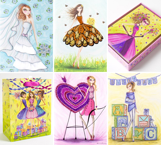
Bella illustrated her first greeting card for Papyrus only a few short years ago, and she has since risen to the top. Her artwork has become a signature offering at Papyrus and it was a collection of her greeting cards that was chosen for a spring end-cap display in Target stores across the US and Canada. Profiled in the 'Behind the Card' section of Papyrus' website, Bella's illustrations are described as "sophisticated and feminine," known for "exquisite, exotic and chic clothing, joie de vivre and refinement." With cards that celebrate life's momentous occasions like the birth of a child to the smaller pleasures of great friends and fabulous shoes, Papyrus has introduced Bella's artwork to millions of people across North America. In addition to the many greeting card designs she has illustrated, over the years she has created art for gift bags and boxes, notepads, limited-edition prints and figurines, and a canvas tote bag that was featured in a recent episode of the CBS sitcom, 2 Broke Girls.

PAPYRUS BP_PapyrusABOVE: Greeting cards, stationery and gift bags for Papyrus
With ad and marketing work for Tiffany & Co., Bloomingdale's, Timex and Target, Bella has been able to appeal to luxury market and mass market consumers equally well here in the US. Overseas clients aim for high end consumers when working with her, including trendy Hong Kong department store LCX, Italian retailers La Gardenia (makeup) and La Perla (luxury lingerie), and the Middle East's first online fashion magazine, Savoir Flair. She recently illustrated for Rosato Collections based in Spain. Specializing in luxury holiday wear, the atelier featured a chic beach goddess on shopping bags and tags. Editorial clients include Elegant Bride, Glamour, Marie Claire, Connecticut Bride and VIV Magazine in the US, Vogue Mexico, Vogue Latin America and L'Uomo Vogue overseas.

ADVERTISING + MARKETING BP_AdvertisingPromotion2LEFT: Rosato Collections / TOP RIGHT: JAFRA Cosmetics / BOTTOM RIGHT: V.swish
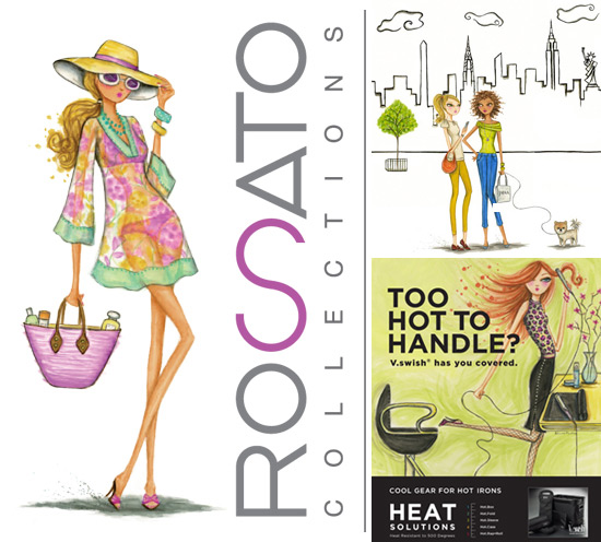
Earlier this year Bella illustrated for JAFRA Cosmetics' Stronger Together 2013 National Conference and Leadership Meeting. Her illustration of fashionable sales associates from coast to coast was set against a modern skyline dotted with lankmarks. It appeared on the conference website and an exclusive tote bag for conference attendees. This was her second time illustrating for the direct sales company, having created artwork for their 2011 'Sparkle with Success' incentive promotion.

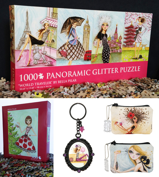
Over the past few years Bella has licensed her art on an impressive array of products. Andrews and Blaine has produced magnetic bookmarks and several puzzles featuring some of her best-loved artwork, including seasonal releases for Halloween and the Winter Holidays, a trendy series of four fabulous fashionistas, and a 1000-piece, glitter-embellished World Traveler panoramic puzzle with more debuting in months to come. Santa Barbara Design Studio released keychains, wood art-blocks, velveteen ipad and zipper cases, and wineglasses. Other products include quilting fabrics, device skins, children's apparel, stationery and toys including a magnetic doll set for Mudpuppy. The European stationery company, The Art Group, has licensed Bella's art for a series of square-format, embellished greeting cards in the Netherlands, and she will soon have new products and licensees in the Australian market in addition to greeting cards with publisher John Sands.

LICENSING BP_Licensing2TOP: Andrews & Blaine / BOTTOM LEFT: Andrews & Blaine / BOTTOM RIGHT: Santa Barbara Design Studio
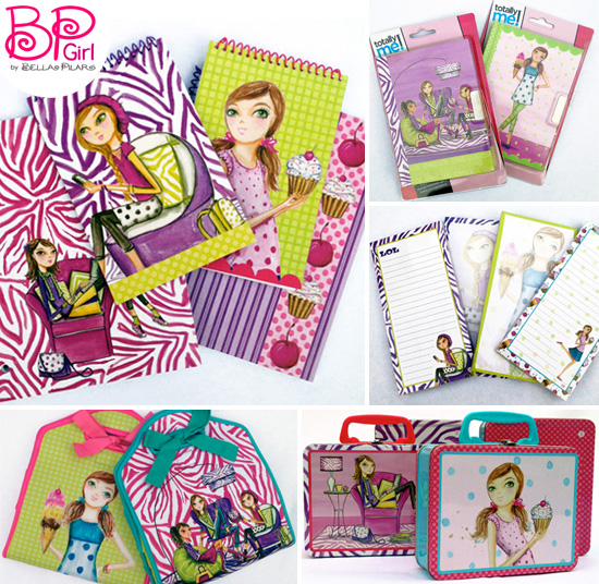
The influence of her two young daughters has motivated Bella in the last year to dedicate a portion of her work to a younger demographic. "I hope to inspire my little girls," she says, "since they inspire me." Last month (March 2013) saw the launch of Bella's BP Girl™ art brand which joins her Bella Pilar™ art brand. First licensed under the Toys R Us label Totally Me!, the debut collection consists of two lines - 'Sweet Tooth' and 'LOL' - perfect for the text savvy tween with a sweet tooth. Each line features neoprene and tin lunch boxes and a range of back-to-school stationery items that include spiral notebooks, writing pads, diaries and magnetic bookmarks. The products are available online and in Toys R Us stores. Visit Bella's blog for more product photos.

BP GIRL BP_BPGirl3ABOVE: BP Girl™ for Totally Me!
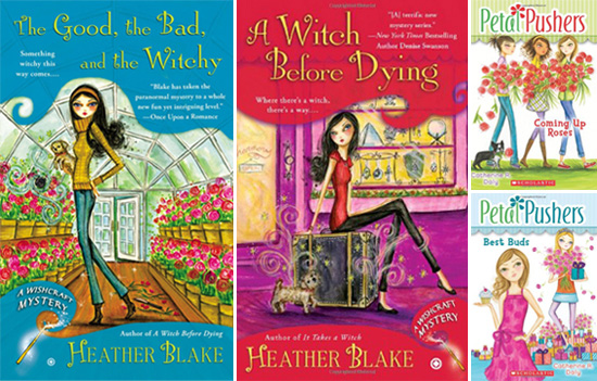
Bella has been illustrating book covers for both a middle reader and young adult series. The Wishcraft Mysteries series (Penguin), written by Heather Blake, follow Darcy Merriweather, a young witch with a knack for solving murders. The series currently includes three titles, It Takes A Witch, A Witch Before Dying, and The Good, the Bad, and the Witchy. The Petal Pushers series (Scholastic), written by Catherine Daly, follows four sisters - Delphinium, Rose, Aster and Poppy - on a string of adventures after their grandparents leave them and their scatterbrained parents in charge of the family flower shop. The series includes four titles, Too Many Blooms, Flower Feud, Best Buds and Coming Up Roses.

PUBLISHING BP_PublishingLEFT: The Wishcraft Mystery series for Penguin / RIGHT: Petal Pushers for Scholastic
While she has a busy painting schedule and a very full family life, we're proud of Bella for finding so much time to help out worthy causes. She provided her glittery 'Cocktail Girls' to Japanese shadow box artists for a Spring 2012 exhibition and auction benefiting the Ashinaga Charity, which helps children orphaned by the Tohoku earthquake and tsunami. In honour of National Child Abuse Prevention Month, she partnered with a shopping centre in Temecula, CA to create a tote bag with 100 percent of proceeds going to a local children's home. Bella has helped the Junior League of New York by illustrating invitations for their annual spring and fall house tours, which provide a glimpse inside some of Manhattan's most stylish homes while raising money for local New York charities. And of course Breast Cancer Awareness Month, for which she has teamed up with Papyrus on an annual basis to illustrate cards and other products (last year, the Chic Warrior Princess card), with funds from the sale of each card donated to the Breast Cancer Research Foundation.

CHARITY WORK BP_CharityWork3FROM LEFT: Chic Warrior Princess for Papyrus / Junior League of New York / Temecula Shopping Center
To see more of Bella's work, along with behind-the-scenes images of her illustration process, visit her blog at junipervalentine.blogspot.com.

Click here to read our previous spotlight on Bella. Click here for downloadable items - desktop wallpapers and a high-res printable letter sized promo.

WALLPAPERS BP_Wallpapers

Q&A with BELLA PILAR

How has your work changed since you first started illustrating? How do you see your work progressing in the future? I have never tried to change my work intentionally. However when I look back on it over the years, I realize it has changed on it's own, organically, unplanned. And I am guessing that with out trying, again, it will continue to slowly change and evolve in the years to come. Lines get stronger or lighter. Girls proportions get more, or less, exaggerated. Hemlines rise and fall. Color palettes change with the moon. It's all ever changing.

A genie grants you three wishes. What do you wish for? 1.To not need sleep. I hate the part of the night where I have to stop working, and go to sleep. Very frustrating. 2. To be able to sketch and paint quicker so that I can get out all of the ideas that fill my head just waiting to be painted. Never enough time. 3. For my artwork and ambition to inspire my two daughters to go after their own dreams and think big.

What is your ideal studio like? Lots of light. Lots of space. And a large lounge area - which would include cozy seating with lots of pillows, stacks of art books and magazines, bowls of candy and chocolates all about and an espresso machine (with a barista please!) for midday lattes.

What is a typical work day like for you? If it's a sketching day - I go right to the coffee shop and camp out a few hours, sketching to good music and the casual chit chat with friends that pop in for their daily fuel. If it's a painting day, I'm in my studio with public radio chatting away at me. My work day comes to an end once I go pick up the kids at school but once they are asleep, it's back to work for the night time shift. I tend to paint and sketch by day and then computer and office work by night (photoshopping or emailing, planning blog updates, web research, etc).

What's the best way to get over a creative block? Sit at my coffee shop, people watch, and flip through magazines. This always does it for me.

What is your biggest challenge as an illustrator? Painting men. Which is why you don't see them much in my work. When I am asked to paint men for an assignment, I usually find myself in a great state of anxiety. But it's a challenge, like any other, and I usually overcome... best I can.

Do you have a favorite movie? I can watch Cabaret over and over and over again and again.

You can only take three things to a deserted island. What do you take? Sketchbook. iPad. Chocolate. Can I take four things? Add an ice latte.

What's your guilty pleasure? Late night online Etsy jewelry shopping (love!) when everyone in the house is asleep.

Who are three artists you admire? My husband and our two daughters are most admirable and inspiring to me. It's non stop creativity here. Our home is like an arts (and crafts) factory. I admire their relaxed and unexpected way of creating. I try to let their free flow form inspire me. I wish I could pick up the paints and just paint something loose and unplanned and not on top of a planned out sketch as I always do. I admire them for being so open to creating without a structured plan in place. My final illustrations have a soft free flow look but the steps I take to create them are quite structured and mapped out.

GRAHAM ROUMIEU

GrahamRoumieu

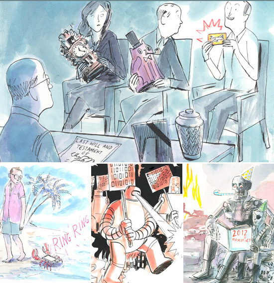
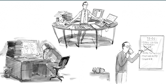
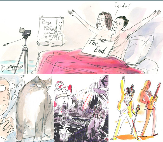
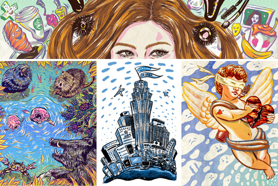
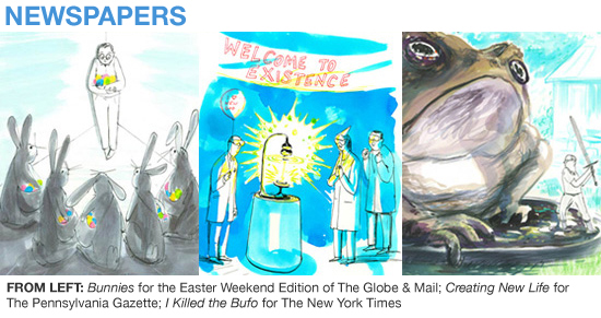
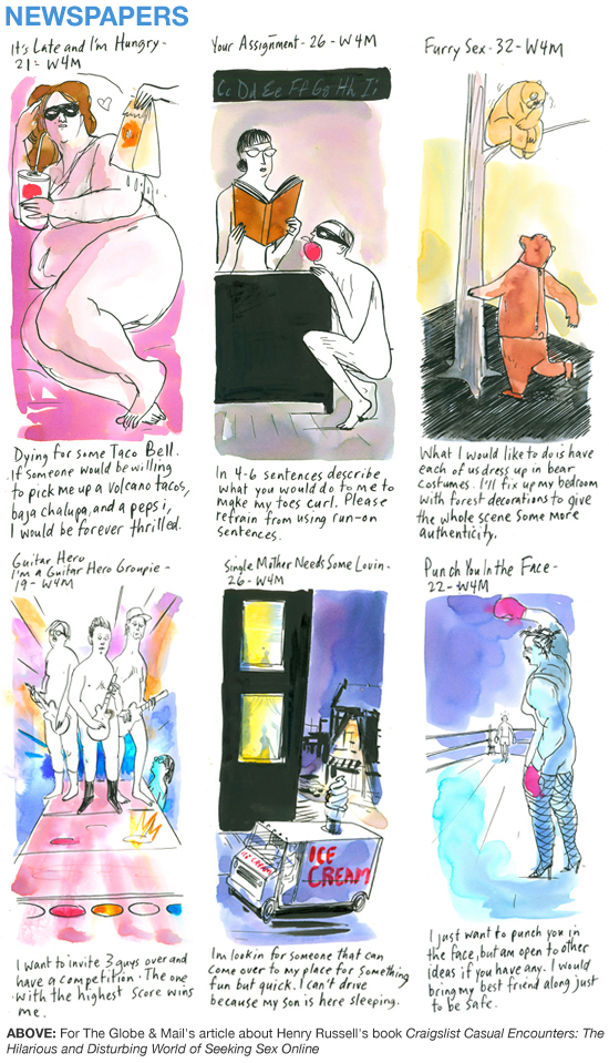
Toronto-based illustrator Graham Roumieu has worked with an impressive number of publications throughout North America and perhaps he has his offbeat - and often irreverent - sense of humor to thank. He has a unique ability to take the mundane and make seem it less so, eliciting laughter with a piece about cellphone roaming charges for The New York Times or the environmental benefits of a strong beaver population for The Atlantic. Whatever it may be, it's working, with regular assignments from The Wall Street Journal, The Globe & Mail, The Walrus, and Real Simple Magazine. 2012 saw a weekly spot with Josh Martz for The Globe and Mail (see all of them here) and a regular lifestyle feature in Canadian Business, offering unexpected solutions for life's little problems, such as using a pencil to fix a stuck zipper and tin foil to sharpen a dull paper shredder.

THE NEW YORK TIMES NewYorkTimesTop: Inheriting Travel Points Bottom from left: Roaming Charges While on Vacation, Robo Right to Speech, Happy New Years from the Future

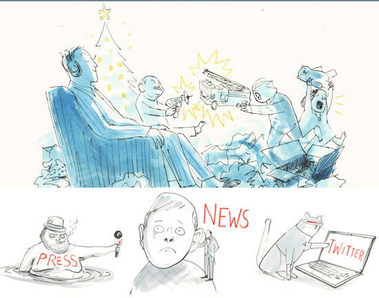
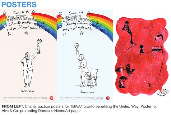
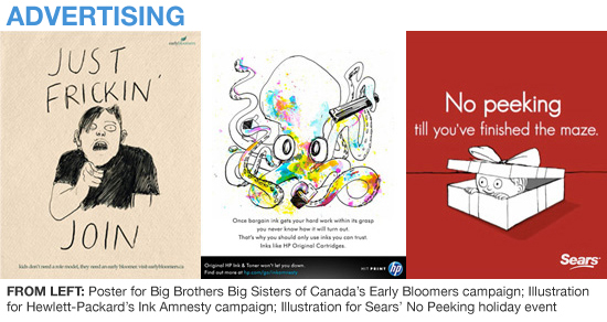
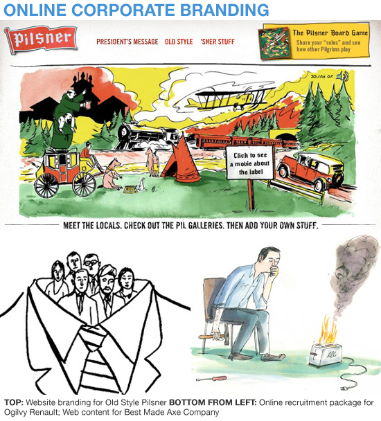
In addition to editorial and publishing illustration, Roumieu has worked on a number of successful print and online ad campaigns and websites, including an out of control squid character for HP's "Ink Amnesty" campaign, peer pressure illustrations for Big Brothers Big Sisters of Canada's "Early Bloomers" campaign, and OOH work for the "No Peeking Event" launched by Sears. He completed several online commissions in 2012, including The Walrus Laughs, a digital project from The Walrus Foundation and Stella Artois, where members submitted and voted for the funniest videos, images and prose. Other projects included the website for writer and producer, Kathryn Borel (www.kathrynborel.com), and another for Two Hours North (www.twohoursnorth.com), a Toronto-based travel services company. For the 2012 holiday season, he created a series of illustrations for North American ad agency, The Hive. The illustrations were part of The Silent Night Playlist, a tongue-in-cheek project aimed at offering some much-needed respite from the stress of the holiday season. Users could download the playlist and enjoy some much-needed peace and quiet with silent tracks such as 'Shortbread Baking' and 'Snow Falling: Extended Mix.'

ONLINE PROJECTS OnlineProjectsTop: Illustration for The Hive's Silent Night Playlist Bottom: Illustrations for writer and producer, Kathryn Borel

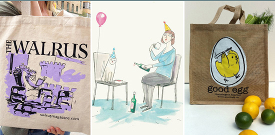
In the past year a number of products debuting that featured Roumieu's artwork, including a tote bag for long-time client, The Walrus, and a series of greeting cards for Whigby, debuting at last year's New York International Gift Fair. Toronto-based business, Good Egg, also commissioned him to illustrate a tote bag for them, later inviting him to create a mural for their Kensington-market storefront. The quirky kitchen supply and gift shop have been long-time fans of his work, carrying his books and a selection of original, framed watercolors. Their website boasts "We've erected a shrine to local writer-illustrator Graham Roumieu at Good Egg. We... welcome you to visit the shop to pray to the artist known as Roumieu."

PRODUCTS Product2From left: Tote bag for The Walrus; Cat & Helen greeting card for Whigby; tote bag for Good Egg

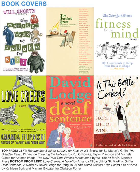
Roumieu was commissioned to create a series of illustrations for philosopher John Perry's book, The Art of Procrastination: A Guide to Effective Dawdling, Lollygagging and Postponing, for Workman Publishing. The book explores something called "structured procrastination" - a phenomenon where one manages to complete a number of smaller tasks as a means of avoiding another, larger chore. The witty illustrations can be seen at the start of each chapter, demonstrating the various ways people engage in the "art of procrastination," from watching cat videos on YouTube to artfully stacking billy clips. He also illustrated the covers for a series of books by politician and author, Shashi Tharoor, for Penguin India.

PUBLISHING WorkmanPublishingAbove: Illustrations for The Art of Procrastination by John Perry (Workman Publishing)

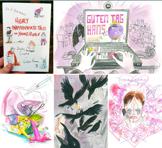
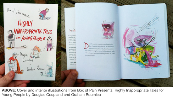
Another recent book project, Highly Inappropriate Tales for Young People for Random House Canada, is a "kooky collaboration" with renowned Canadian author, Douglas Coupland of international bestseller Generation X fame. Coupland contacted Roumieu after becoming a fan of his Bigfoot books and it didn't take long for the project to begin taking shape. Composed of seven hilariously improbable tales with characters like Donald the Incredibly Hostile Juice Box, Hans the Weird Exchange Student and Brandon the Action Figure with Issues, the book is not really intended for children. Roumieu says "I guess this would be R-rated. [Although] I don't know whether one juice box stabbing another juice box in the head with a bobby pin necessarily constitutes R anymore." The book has received great reviews with talk of a sequel being batted about. Michel Basilieres of the Toronto Star says the tales "match perfectly the loose, surreal and imaginative images Roumieu revels in. It seems as likely that the stories were written to match the images as the other way around." Click here to read Communication Arts' glowing review for Highly Inappropriate Tales and here to read even more praise. You can watch an animated trailer for the book here.

HIGHLY INAPPROPRIATE TALES InappropriateTalesAbove: Illustrations for Highly Inappropriate Tales for Young People by Douglas Coupland (Random House Canada)

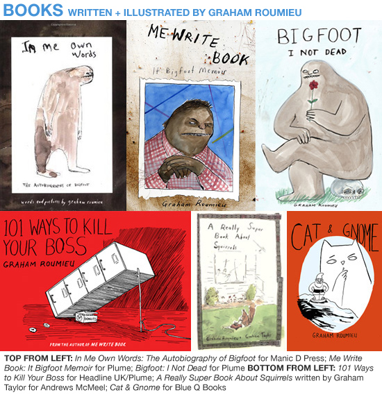
In all he has authored and illustrated six books: 101 Ways to Kill Your Boss (Plume), Cat & Gnome (Blue Q Books), and his cult classic Bigfoot series. In 2003, Roumieu published the first in this series of Bigfoot autobiographies, In Me Own Words: the Autobiography of Bigfoot. Written from the perspective of a jaded, egomaniacal ex-legend whose hobbies include terrorizing forest critters and composing screenplays, the books Me Write Book: It Bigfoot Memoir and Bigfoot: I Not Dead (Plume), have quickly become a cult favorite. Bigfoot's antics have inspired readers to write Bigfoot songs, make Bigfoot dolls, and even bake Bigfoot cakes. The very hairy leading man has thousands of followers on Twitter, where he regular charms fans with sayings like, "Secret to great smile is use Lee Press On Nails as veneers" and "Wearing two sashes and a cummerbund. It just feel right."

THE GLOBE & MAIL GlobeMailAbove: Home Porn Bottom from left: Crazy Cat People; Sinister Canada; Queen

Bigfoot's charm stems from a stubbornly juvenile outlook that is by turns abrasive and endearing. In one chapter, Bigfoot admits that his less-than-eloquent speech patterns made him the target of bullying in high school. His confession accompanies a flashback of teenage Bigfoot tearing down the opposition (literally) at a high school debate. A decapitated head lies on the linoleum as two recent amputees cower in a pool of their own blood. Red ink, smeared and spattered throughout the page, vividly relays the relish with which Bigfoot dismembers his competitors.

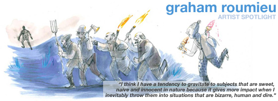
Roumieu's wildly energetic, and sometimes gleefully gruesome, brushwork sometimes seems at odds with his underdog sensibilities. In a recent interview, he says, "I think I have a tendency to gravitate to subjects that are sweet, naive and innocent in nature because it gives more impact when I inevitably throw them into situations that are bizarre, human and dire." With Bigfoot, Roumieu has combined all of the above, producing a creature whose displays of ego rival only his bouts of crippling insecurity.

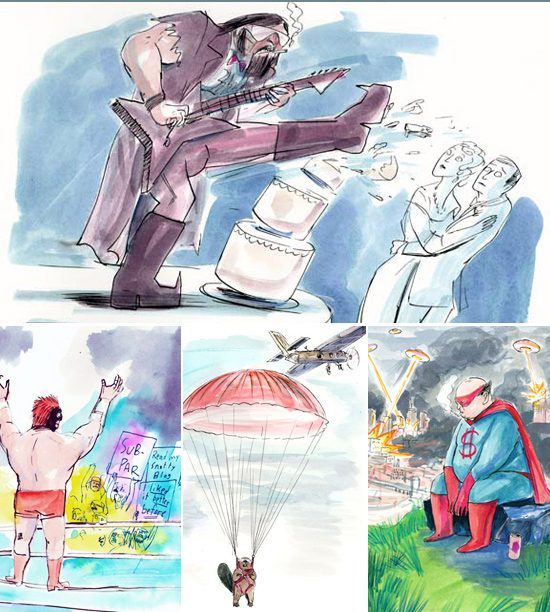
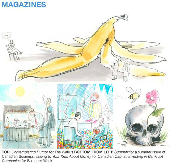
MAGAZINE WORK Magazines2Top: The Wrong Wedding Singer for American Way Bottom from left: Hecklers for Print; Leave It to Beavers for The Atlantic; Unreliable for Institutional Investor

Roumieu's 101 Ways to Kill Your Boss has been universally applauded and published in many countries worldwide. Imagine eviscerating your boss with a giant laser pointer, quitting your job via ninja courier service, laying a trap by way of urinal guillotine. Roumieu takes office politics to the next level with increasingly extreme tactics for boss-icide. His illustrations find the bizarre and the funny in even the most mundane office environments. Linked together by a deep yet twisted look into the human psyche, Roumieu's work continually surprises viewers with its insight and its ability to elicit gut-wrenching laughter.

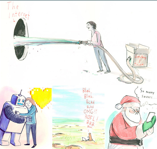
AWARDS AwardsRealSimpleAbove: Illustrations for the Real Simple Guide to Social Media Sites for Real Simple magazine

His work has been honored by American Illustration, Communication Arts, Society of Illustrators, Applied Arts, the HOW International Design Awards, the Advertising & Design Club of Canada, the Coupe International Design Competition, the SPD Spots Annual, and the National Magazine Awards. Most recently, he received a merit award from The Art Directors Club of New York for the Real Simple Guide to Social Media Sites for Real Simple Magazine. The series, which was also chosen for inclusion in 2012 Print Regional Design Annual, takes a comical look at the world of Facebook and Twitter, offering tips on navigating them both. In January 2012, his novelty Twitter feed for Bigfoot was named one of HOW Magazine's Top 10 Websites for Designers. When he's not illustrating, Roumieu teaches at OCAD University, Canada's largest and oldest art and design school.

Click here to read our previous spotlight on Graham. Click here for downloadable items - desktop wallpapers and a high-res printable letter sized promo.

Q&A with GRAHAM ROUMIEU

How has your work changed since your days as an art student? How do you see your work progressing in the future? If someone were to look at all of my work over the last ten years or so, I think they'd see a steady growth of technique, thought, and personality. As for the future, this work has been a part of my life for so long now that I can't imagine engaging and understanding the world through means other making pictures, so I hope that it is always very much a part of what I do day-to-day. And through continuing to do that, I hope to continue to get better - hopefully in ways I couldn't possibly imagine now.

What's the first thing you do when you’re stuck on a project? What are your best sources of inspiration? Getting up and moving around and doing something else and talking to people or reading pretty much will solve any blockage quickly. Or, imagining that if you don't get the work done everyone you know and love will die horribly. I don't actually use this technique, but if you are having troubles, try it. It might work if you aren't heartless and lazy.

In an ideal world, you would have an infinite amount of? Awesome dance moves, perfect for any occasion or non occasion. FYI I am a terrible dancer.

Use three words to describe your style. Best I got?

What is a typical work day like for you? Pretty standard and disciplined, actually. Morning coffee, check email, read newspaper, maybe eat breakfast, shower, dress, sit at my desk, draw pictures, write stuff or do paperwork, maybe break for lunch, more afternoon work, bits of domestic household fixing and washing if needed which sometimes helps my thinking, and then my day is over, and what I do on my own time is no one's frigging business (greyhound track, eat pizza in parking lot, fall asleep in park).

What is your ideal assignment? Oh I love all sorts of different challenges that come with different assignments, so I can't say one is better that the other. Unless they come with challenges that make me hate the world. Those assignments are the worst.

What is your favorite part of living and working in Toronto? The giant hawk that perches himself on top of the CN Tower every day and makes everyone frightened. He keeps things real. I can't believe it doesn't draw in more tourists.

Do you have a favorite movie? Being There

What are some sites you have bookmarked in your browser? Jillian Tamaki's Super Mutant Magic Academy http://mutantmagic.com/ New York Times http://www.nytimes.com Atlas Obscura http://www.atlasobscura.com/

What's the best and worst part of being an illustrator? Upside: Usually my Pictionary opponents run out of the room sobbing. Downside: Usually my Pictionary opponents run out of the room sobbing.

You have 24 hours to live the life of one fictional character. Who do you choose? R2D2. Gets to be a part of amazing things, really doesn't have to do much.

Best way to end a long day of work? Skipping in circles giggling and clapping with delight as someone sprays me with Champagne.

JUNGYEON ROH

JungyeonRoh

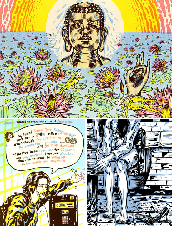
Inspired by the humorous and hip, Jungyeon Roh's vigorous line brings life to scenes that course with dialogue and the honesty and intensity of nature. Not afraid to address the gritty, grungy or gross, she is equally capable of capturing intimate scenes as well as expansive ones filled with detail and context that honor a sense of place. Overt gestures make a statement in her work, whether they're connected to hip Brooklyn-ites, butchered pig's heads or sassy tufts of animated soy in a mushroom amusement park of vegan heaven.

ADVERTISING AdvertisingFROM LEFT: YouTube Europe; Facebook Asia; Cleveland State University

Born and raised in Seoul, South Korea, Jungyeon moved to the U.S. in 2006 to study at New York's renowned School of Visual Arts. She earned her BFA in Illustration and Cartooning in 2009 and went on to complete her MFA in Illustration as Visual Essay in 2011. She currently calls the Upper East Side home and considers New York the best city for artists to live in, saying "New York always makes me work harder. It is full of cultural icons and I find myself creating something new from these influences."

MAGAZINES MagazineFROM LEFT: McSweeney's Lucky Peach; Bloomberg Businessweek; Plansponsor

A recent graduate, Jungyeon has already made quite the name for herself. She was named one of PRINT magazine's 2012 New Visual Artists, winning praise from some of the industry's biggest talents. Josh Cochran, her thesis advisor at SVA, says "There's a certain sense of intensity to her work that feels surprising. I think she gives off a different persona in person, but she is definitely not afraid to get down and up close with a lot of her subjects." Jungyeon has received two gold cubes and a bronze cube from the Art Directors Club, a silver medal from the Society of Illustrators of New York, and a silver medal from the Society of Illustrators Los Angeles. Her work has been recognized by numerous associations and publications, including Society of Illustrators L.A., Print, Altpick, Communication Arts, American Illustration, CMYK, 3x3 and Creative Quarterly.

AWARD-WINNING AwardsTOP: Society of Illustrators 52, Creative Quarterly 18, CMYK 49 BOTTOM FROM LEFT: Art Directors Club 90th Annual Gold Cube; Communication Arts 52, American Illustration 30

PRINT Magazine says "she uses a Crumb-esque style that makes commonplace scenes seem almost grotesque." There is definitely a comic-book style to her work and it is not surprising Jungyeon sees herself as a visual storyteller, saying "drawing pictures is my autobiography." With personal subject matter ranging from Korean public bathhouses to failed relationships, Jungyeon is not afraid to tackle subjects that others may shy away from. "I'm from a conservative culture, so it can feel really embarrassing, but I just keep doing it anyway," she says. "I've been always honest not only in my work but also in my life. I shouldn't hide anything for my work, so then people could share the feelings from my true-based stories."

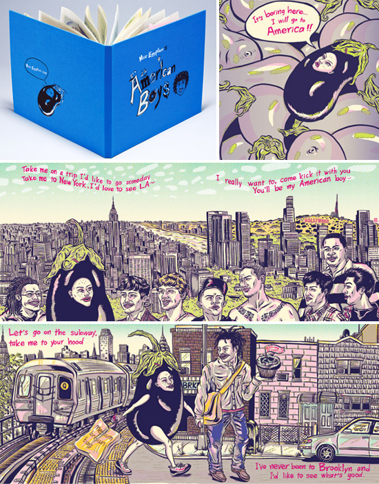
MISS EGGPLANT MissEggplantABOVE: Selections from Miss Eggplant's American Boys

True stories and honest emotion have led her to be inspired by song lyrics as well, a personal series based on Estelle's hit American Boy song resulted in a handmade limited edition book. Sharply humorous, she cast herself as a voyeuristic newbie, even more distanced from the song's 'Boys' by her guise as a girlish eggplant. The series struck a chord, winning a number of awards and honors, including an ADC Gold and a SILA Silver, among others. The complete series can be seen here.

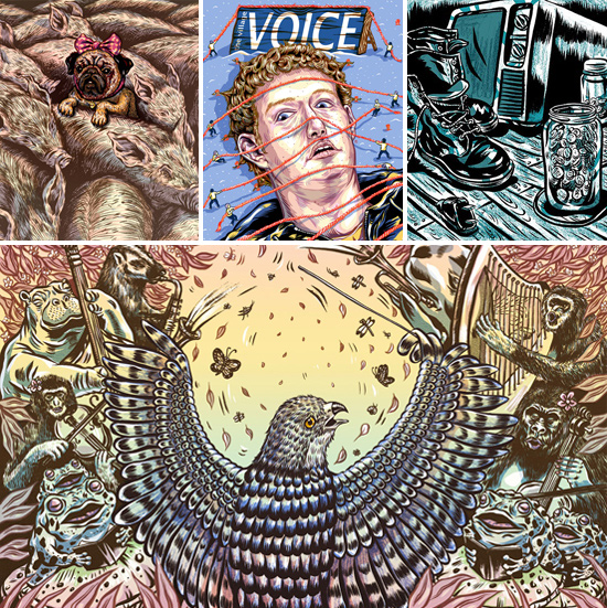
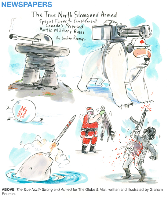
NEWSPAPERS NewspaperTOP FROM LEFT: The New York Times; The Village Voice; The Stranger BOTTOM: The New York Times

Jungyeon's style lends a sense of humour to her editorial assignments as well. A cover for New York mainstay, The Village Voice, depicts Facebook-founder, Mark Zuckerberg, as an evil giant restrained by the townspeople for their article, Rise of the Facebook Killers. It was selected to appear in the American Illustration 31 Annual. Another recent piece for the Columbia Journalism Review had Jungyeon illustrate an amusing map called the 'Celeb-O-Matic,' a tongue-in-cheek guide for journalists seeking access to Hollywood's elite. Other editorial clients include Bloomberg Businessweek, Columbia Journalism Review, McSweeney's Lucky Peach, The New York Times, Orange County Magazine, The Stranger and Willamette Week.

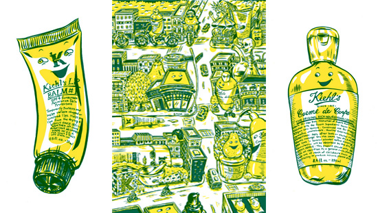
KIEHL'S DAY Advertising-KiehlsABOVE: In-store signage and promo material for Kiehl's Since 1851

Jungyeon has a growing but impressive list of international advertising clients, most recently illustrating for Kiehl's Since 1851. In 2003, New York City mayor, Michael Bloomberg, declared November 12th 'Kiehl's Day' in honour and recognition of their ongoing contributions to the community. Since then Kiehl's stores worldwide have joined in the celebration, making significant contributions in their own communities to commemorate this special day. Jungyeon's illustrations could be seen on Kiehl's in-store signage and promo materials in stores worldwide. International clients include Facebook Asia and YouTube Europe.

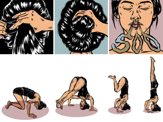
YOGA GIRLS Fitness ABOVE: Personal work

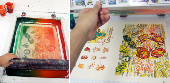
An avid runner and yoga enthusiast, Jungyeon is inspired by health and physicality in her work as well. While she appreciates the planning and precision that the silkscreening process requires, it was her desire to keep moving that initially led her to printmaking. "Silkscreening is very active and requires a lot of energy," she says. "I'm like an athlete-illustrator!".

SILKSCREENING PROCESS SilkscreenProcess

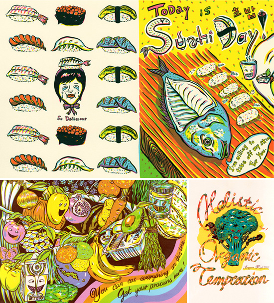
Food is a recurring theme in Jungyeon's work and was the subject matter for two handmade books. 'Today is Sushi Day' follows a group of female sushi masters as they teach Americans how to properly eat sushi. It received a Gold Cube at the ADC 89th Annual Awards and a Silver Medal from the Society of Illustrators 52. It was also recognized by American Illustration 28, the 3x3 Illustration Annual No.6 and Creative Quarterly 16. The complete series can be seen here, and a personal project connected to it that was created for the Whitney Museum of Art's Comic Zine Party. In H.O.T., Jungyeon illustrates advocacy for the environmental and health benefits of a vegan diet. The series received a Bronze Cube at the ADC 91st Annual Awards and appeared in the Society of Illustrators 54 Annual.

Click here for downloadable items - desktop wallpapers and a high-res printable letter sized promo.

FOOD FoodTOP: Selections from Today Is Sushi Day BOTTOM: Selections from H.O.T.

Q&A with Jungyeon Roh

What are you reading/watching/listening to right now? I'm listening sounds of the movie Ice Age from the television.

What is your favorite part of living and working in New York? Upper East Side. I've been living here more than four years now, and it was one of the best choices I've ever made after I came to New York. It is also home to Museum Mile, close to central park and the most peaceful and safe part in Manhattan. I also found the best yoga studio here, but the only thing U.E.S needs is opening Whole Foods at 86th street!

What's one tip you have for other creative professionals? Enjoy your life outside of your studio (work), be thankful what you have, and fall in love with learning.

What three words best describe your style? Humorous, cheerful and playful.

What is a typical work day like for you? I tried to work as full time, 10am to 6pm and off for evenings and weekends. I have lots of things to learn outside of the studio, but it's hard to keep the regular schedule since I'm a freelancer.

How has your work changed since you became an illustrator? I used to paint on wall-sized canvases in Korea, and did endless printmaking while I attended at SVA, but now I’m drawing by hand and coloring by digital for illustration jobs.

What's the best way to get over a creative block? Go to hot yoga and try to do headstand.

You can only take three things to a deserted island. What do you take? An apple, passport and brush pen.

What is your ideal studio like? A studio where inside is my own silkscreen and digital equipment and outside is a swimming pool or beach where I can jump right into the water after finishing jobs.

What are some sites you have bookmarked in your browser? I don’t really bookmark any sites.

In an ideal world, you would have an infinite amount of... ? Mom’s food.

Best way to end a long day of work? Taking a hot shower.

SUMMER READING

This summer, we're presenting a selection of our artists' favorite books. From dark, to funny, to just plain strange, this summer reading list gives you a peek inside each artist's life, likes, and literary predilections.


EleanorGrosch

EleanorGrosch

ELEANOR GROSCHThe Road by Cormac McCarthy. "Disturbing, horrific, and somehow hauntingly beautiful." The Hunger Games by Suzanne Collins. "Really fun with a nice dark quality."

HennieHaworth

HennieHaworth

HENNIE HAWORTHCall the Midwife by Jennifer Worth. "Recently I've been enjoying reading a book called Call the Midwife. It's the true story of a midwife working in London's East End in the 1950's. Having just had a baby in East London, it had a particular interest for me, but it's a very popular book and was recently made into a TV show by the BBC (but the book's much better). It's really startling how much life and medicine has changed in such a short space of time."

BellaPilar

BellaPilar

BELLA PILAR20th Century Travel: 100 Years of Globe-Trotting Ads. "There is always a Taschen book on my list of favorites. And this is my latest fave. Travel through the history of travel ads. I am beyond inspired by the gorgeous colorful artwork filling these pages - the images, design, colors, its the total package. These colorful ads are filled with storytelling imagery that remind me how big the world is outside my little art studio. They will make you look at a train, plane, and automobile in a whole new light." 100 Years of Fashion Illustration. "Always one of my faves. Beautiful artwork to gaze over. And a fact filled blurb of info on each page. What a treat to look at the history of fashion presented this way. Each fashion illustration tells its own little story. It's fun to see the progression of style and trends (fashion and art) over 100 years all wrapped up in one little book."

GrahamRoumieu

GrahamRoumieu

GRAHAM ROUMIEUThe Bet by Arthur Bradford. "One of my favorites is just a short story from a McSweeny's but is probably the funniest thing I've ever read."

ELEANOR GROSCH

Eleanor Grosch's playful arrangements of line and form are sleek, minimalistic experiments in geometry. Whether it's an arched beak, a meandering tail, or the sleek lines of a bicycle, Eleanor's illustrations rely on sparsely articulated lines to convey shape and motion. Her understated colors complement the subtlety of her forms and soften her sleek geometric compositions. Well-known for her unique modernist perspective on the feathered, the furry, and the scaly, Eleanor brings a designer edge and distinct mid-century aesthetic to all of her artwork.

Eleanor draws inspiration from sources as diverse as the Spanish abstract painter Joan Miro and modernist illustrator Charley Harper. In 2010, Harper's estate asked Eleanor to redesign charleyharperprints.com. Eleanor's prints have even appeared on the site alongside Harper's work and that of Harper's descendants Edie and Brett Harper.

Eleanor was named one of Print Magazine's New Visual Artists of 2008. The New Visual Artist Review introduces and profiles thirty of the most promising rising talents in graphic design, advertising, illustration, digital media, photography and animation - all under the age of thirty. The competition is by invitation only with entrants being nominated by art directors, designers, critics and industry professionals. In the article, Emily Gordon writes, "Grosch walks a cheerfully nonchalant line between cute and cool, using [...] a menagerie of whimsical imagery."

Always the 'class artist,' Eleanor began developing her style, and a fascination for animals, in her early teens. "I'd draw during class and then more when I got home," she remembers. One thing that hasn't always been constant has been her confidence in pursuing art as a profession. In an interview with Philadelphia Magazine, Eleanor recalls hearing a professor say, "'In five years, only one person in this room will be making a living doing art." As a fledgling art student, Eleanor remembers thinking, 'It's not going to be me.' She jokes that, "My big goal was, 'I hope one day I get a chance to make something for someone for free.'" Since then, Eleanor has learned that a confidence in your work is essential. "You have to have good self-esteem about your work. Assuming someone's going to like you is a good start."

Shortly after graduating from art school, Eleanor landed her first gig illustrating and designing a poster for the Orpheum in Tampa, Florida. "I used to dance there, and I remember seeing my poster up for the first time!," she says "What a thrill!!" The design was for the first of many band posters, the sum of which ultimately caught the attention of an editor at Nylon Magazine. Since then, her work has appeared in magazines, books, products and packaging, as well as in corporate advertising campaigns. Eleanor has worked with clients such as Keds, The San Diego Zoo, Oxfam, Starbucks, Chronicle Books, Land of Nod, Urban Outfitters, and Shutterfly.

Eleanor's first experience with licensing was when Keds launched a line of her shoes in 2006. Modeled in print ads by Mischa Barton, known for her role on the TV series The OC, the shoes flew off the shelves and Eleanor Grosch as an art brand had arrived with a splash. Since then, her work has appeared on a variety of licensed products, from Giro helmets and Alien Workshop snowboards, to wall art for Muralstick and stationery for Marian Heath and Tiny Prints. Her gulf-inspired luggage tags for Zehno also appeared in Print Magazine's 2011 Regional Design Annual. Sale of Eleanor's tags benefitted the Coalition to Restore Coastal Louisiana, a non-profit organization that advocates for Louisiana's wetlands.

Marian Heath recently released a line of nine glitter-embellished greeting cards featuring Eleanor's artwork, which they describe as featuring her "smart, hip aesthetic and trademark graphic style." Her feathered friends are on trend in the UK as well, with seagulls and skimmers appearing on Printermakers cards by the publisher Art Angels. The biggest volume of card designs can be found at Tiny Prints with dozens of print-on-demand custom stationery and card products.

In addition to her work as an illustrator, Eleanor also runs Pushmepullyou Design, an online shop selling art prints, t-shirts, accessories, and housewares. Inspired by Dr. Dolittle's two-headed llama, the name 'Pushmepullyou' captures Eleanor's love of animals and her whimsical sense of humor. For all things Eleanor, from greeting cards and magnets to wallets and tote bags, visit http://www.merchline.com/pushmepullyou/.

Eleanor's work has also been featured in Grain Edit, Design*Sponge, Philadelphia Style, Philly Mag, NYLON Magazine, and The Art of Modern Rock. Eleanor has been a guest speaker at the 2010 HOW Design Conference and at Dallas AIGA. Eleanor is also a recipient of the PETA Libby Award, which is awarded for the quality of animal-friendly products as well as the nominee's enthusiasm for animals.

Wherever she looks, Eleanor is drawn to clean lines and striking colors. To see more of her work, visit www.justeleanor.com.

Click here for downloadable items - desktop wallpapers and a high-res printable letter sized promo.

Q&A with Eleanor Grosch

Use three words to describe your style. Simple, bold, colorful

What is a typical work day like for you? How do you portion off your time? I usually start at 8 with a nice breakfast and then get right to it; I find I'm most productive in the morning. Then I gotta move around a bit so I clean the house for about 30 minutes or go to the gym. Afternoons I usually need a break also, so I watch some TV for another 40 minutes or so in-between working. I try to stop at 5PM these days, but I find that I'll often draw something in the evening.

A genie grants you three wishes. What do you wish for? Probably a quick-travel system of some sort, slightly longer hotter legs, and a never-ending income stream for my Mom so she could retire right away.

What is your ideal assignment? Anything where I get a solid concept. I love the challenge of conceptual thinking. You're dressed like a mime on the front page of your website. What's the story behind that? That came from a fun photo shoot with my friend, photographer Brae Howard. I think I've always loved mime makeup, so we went for a couple of shots with that look and it turned out to be my favorite photo. Plus, it makes me look fun, which I think I am most of the time!

What's the best way to get over a creative block? Do something completely unrelated - take a bike ride, do something physical. It usually straightens me out really well.

What's one tip you have for other creative professionals? Never, ever, stop making your work. Someone will like it eventually! I think the people who "make it" are those with staying power.

What is your favorite part of living and working in Philadelphia? I love the small, cute scale of the city. It's bike-able and walkable and has lots of the cool things that NYC has but in a cheaper and less tiring way. I'm just not cut out for a place like NYC, so it's nice to live in a city where there's a slower pace.

If you were reincarnated as an animal, which animal would you be? Definitely a flightless bird. Probably an ostrich - big legs, long neck, fidgety. I've even been dressing like a female bird more and more lately: beige, gray, brown - dull colors for safety.

Do you have a favorite movie? For the past 10 years, it's been The Fugitve. We'll see if something tops that...

I hear that you're also a trapeze artist. How did you get started? Is it hard to balance your passion for trapeze with your illustration career? N/A - I quit since I was so awful at it!

What are some sites you have bookmarked in your browser? I love my brother's blog: www.lifeisrealgood.com - he's biking around SE Asia right now. Sounds very cool but very tiring and difficult. I love his writing style; it's super funny with short sentences. Also, catalog-choice, an opt-out service for those annoying catalogs companies keep sending us all.

Do you listen to music while you work? What's the best and worst type of music for getting things done? No, I usually watch TV or have silence. Music, for me, is better for home-repair jobs. Sundays I get my little groove on to R&B while I'm painting or fixing or cleaning. So fun!

If you could be anything besides an illustrator, what would you be? I would love to be a smart computer person or someone who does hard physical labor part time. Or maybe a house cleaner? I'm really good at cleaning.

What is your ideal studio like? It's my couch!

HENNIE HAWORTH

Intricately drawn details and a light, mixed-media aesthetic are what make Hennie Haworth's work engaging, eccentric, and inventive. Hennie's hand-drawn lines give her work a charmingly irregularity, while her judicious use of decorative elements imbue her art with a sense of whimsy. Whether it's a Tokyo street or a Parisian boulevard, Hennie's eye for color, texture, and architectural detail lends a rich and intricate character to her scenes and cityscapes. Her handlettering has a similarly lavish quality, with letters swooping into languid patterns that are at times loose and naive, and at other times delicate and sophisticated.

Hennie's work has appeared in books, newspapers, magazines, ad campaigns, packaging, on products and more. She has worked with clients as diverse as Bloomberg Business Week, Penguin Books, BBDO (South Africa), Samsonite (Japan), and Urban Outfitters (UK). Hennie's work has also been honored by the Society of Illustrators in New York.

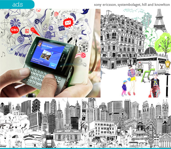
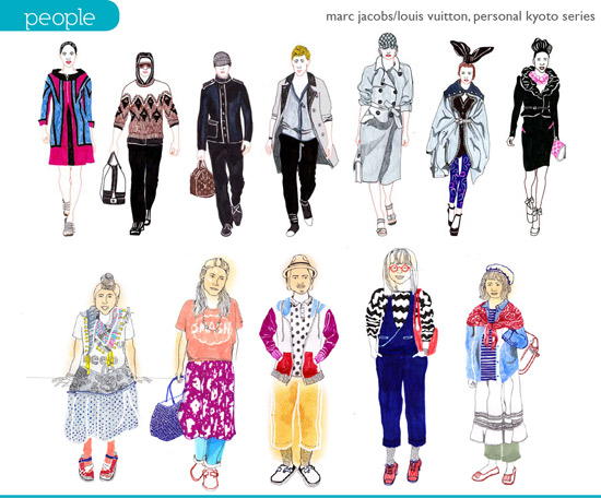
Her latest project has been a series of illustrations for the partnership between Marc Jacobs and Louis Vuitton. Hennie's artwork features stylish 'head to toe' portraits set in the fashion capitals of New York and Paris. The illustrations were integrated into Marc Jacobs's profile on the Louis Vuitton website.

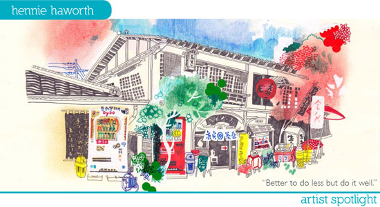
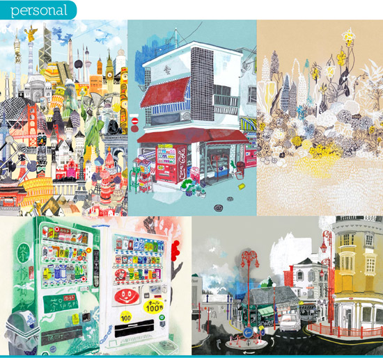
Currently based in East London, Hennie loves the city but has also been influenced by her travels through Japan. Her series of Tokyo vending machines captures the condensed spaces and unique color schemes of urban Japan. She has worked on a number of creative collaborations with Japanese companies and organizations. In 2011, Hennie participated in a project called 'One Thousand Cranes' for Japan. She contributed patterned designs to the organization, which used the origami theme to benefit the Japan Earthquake and Tsunami Relief Fund. The project draws upon the Japanese belief that folding one thousand cranes will allow you to make one wish come true.

A series of Japanese vending machines and portraits of Kyoto people are two personal projects that sprang from Hennie's travels through Japan in 2010. Hennie believes that "personal projects are very important and are often the work you're most proud of." She uses personal projects as a way of developing her skill set and experimenting with new techniques. Her portraits of Kyoto's citizens explores fashion through the lens of Japanese youth culture. As Hennie meticulously details her subjects' patterned tights and bunched up sweaters, she demonstrates her eye for detail. Hennie's fascination with detail is one of her biggest strengths, but it also means that sometimes she tells herself that "it's better to do less but do it well." When working, Hennie always tries to balance the depth of detail with the charm of simplicity.

Clients from a growing list of countries have assigned work to Hennie, from South Korea to Sweden to China, the UK, Germany, Japan, South Africa, and Italy. She has worked with South Korea's Hyundai Department Stores, and Systembolaget, a Swedish chain of wine and spirits retailers. Hennie's handlettering has also appeared on packaging for the eponymous UK supermarket chain Waitrose, which commissioned illustrations for an exclusive line of holiday treats.

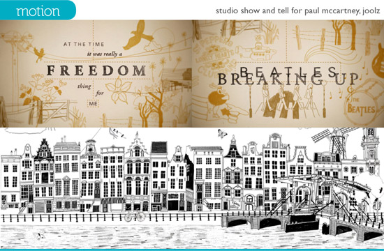
She has recently worked on motion projects, creating content for animated broadcast and online ads. Her work set the backdrop for a moving image spot by Joolz, an Amsterdam-based baby stroller company. These black and white line drawings were later reproduced as a wall mural in a Joolz retail store. Hennie's animated trailer for Paul McCartney's latest release, The Album Story, was recently featured at the London Short Festival. Produced with the help of talented Ali Assaf and Rob Tovey of the London-based Studio Show & Tell, Hennie's illustrations and handlettered titles evoke the nostalgic and melodic qualities of McCartney's music.

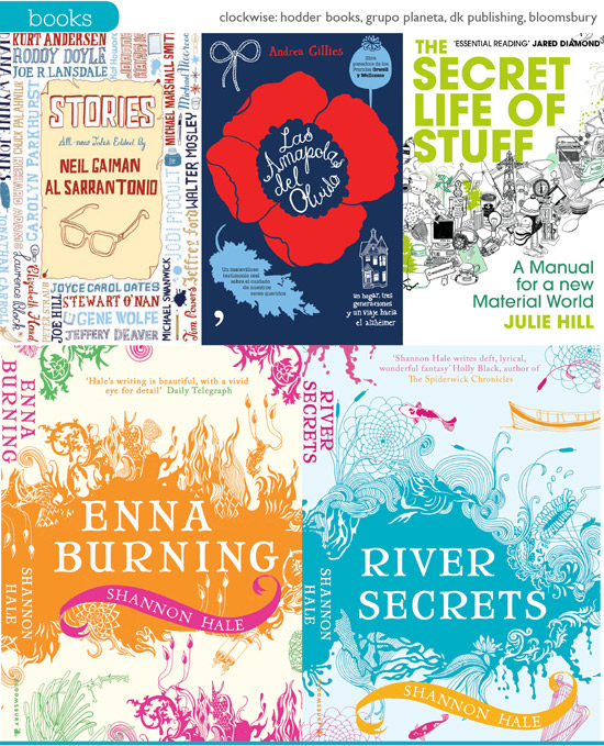
Hennie has also illustrated several book covers, including Michael Pollan's In Defense of Food (Penguin), Julie Cohen's The Summer of Living Dangerously (Headline Review), Alberto Ferrars's B as in Beauty (Random House), Karen Phillips's The Truth About My Name (Klutz), Andrea Gillies's Las Amapolas del Olvido (Grupo Planeta), and How to Cook: Delicious Dishes You'll Really Want to Make (Dorling Kinsey). Hennie's cover for Klutz's The Truth About My Name features dozens of handlettered names, stylized to resemble the names scribbled into schoolgirl notebooks. The book includes a variety of games and quizzes that help girls find the hidden meanings behind their first names. Her series of covers for Shannon Hale's Books of Bayern series (Bloomsbury) feature decorative elements that evoke the aquatic and the fiery elements of each plotline. The Goose Girl, River Secrets, Book of a Thousand Days, and Enna Burning are available through Amazon and Bloomsbury.

Having a dual talent for illustration and handlettering have made Hennie Haworth an invaluable collaborator for a long and diverse list of clients. To see her latest work, visit her Magnet Reps portfolio or her personal website at henniehaworth.co.uk.

Click here for downloadable items - desktop wallpapers and a high-res printable letter sized promo.

Q&A with Hennie Haworth

What do you do when you have a creative block? What are your best sources of inspiration? I find exercise is a great way to get past it. Taking a break, getting some air, and coming back to it later with fresh eyes really helps. I'll just think about something completely different for a while, and that normally gets me going again.

I think inspiration can be everywhere you look, it's just a case of being open minded.

What are some sites you have bookmarked in your browser? I love having a look at Print & Pattern (http://printpattern.blogspot.com/) and Design Sponge (http://www.designsponge.com/).

What's the last movie you saw and how did you like it? Bridget Jones! But it was just on over Christmas. The last film I watched at the cinema was a Buster Keaton one called The General. It's an old silent movie, and they had someone playing the piano live along to it which was really great. It's really funny and the stunts he does are so clever - and dangerous when you think how long ago it was made, before special effects and all that stuff.

What is your biggest challenge as an illustrator? There are lots! One thing I always have to remind myself is to keep things simple. I easily get carried away and clutter the page up if I'm not careful.

What is a typical work day like for you? How do you portion off your time? I get up around 7 and try to go for a run. Then I come back and have breakfast, and a nice strong coffee! After that I'll reply to all my emails, and then I start work on whichever project I'm doing. I find you have to be very flexible with your time as an illustrator. I always take a break for lunch, but the time I finish always varies - sometimes late into the night.

Do you listen to music while you work? What's the best and worst type of music for getting things done? I don't really listen to music while I work, mostly I listen to Radio 4 which is all talking. The funny thing is that when I look at my drawings I can remember all the programmes I listened to.

How has your work changed since you've become an illustrator? How do you see your work progressing in the future? Working for other people has taught me a lot about what works and what doesn't. Having feedback from so many different art directors and designers on separate projects has been really beneficial. They'll often suggest things I'd never thought of doing and it's nice to be surprised when it all comes together.

In the future I want to make more time to do my own projects. It's always a struggle but it's really satisfying when something is all yours right through from the idea to the production.

If you could be anything besides an illustrator, what would you be? Ooh there are lots of things, and I'm not sure how realistic a lot of them are, but I'd love to be a spy!

What is your ideal studio like? Nice big windows and lots of friends working there too. I love being able to stop work for a break and catch up on all the studio gossip over a cup of tea!

What is one tip you have for other creative professionals? Make sure you're happy with how things are going - never get trapped into feeling like you're stuck doing things you're not interested in.

You studied illustration at Brighton University. How did a formal arts education shape your style and method of working? I'm not sure. I guess I didn't really know that illustration was something you could do professionally, when I started at Brighton - I just liked drawing. It was only while I was there that I saw what people did and realized I could too. So maybe I'd just be still doing it as a hobby.

What's the best way to continue improving your skills as an illustrator? (Sketching, interacting with other artists, etc.) All of that, and lots more. I wouldn't know what the best way was, but there are certainly lots of good ways. Those two that you've mentioned, as well as trying new things, learning about all the things your materials can do - including the computer, listen to other people's advice and try it out. I just try to make sure that I always look for what I find interesting; I think that helps me develop and not get stuck in any one way of working.
You currently live and work in London. Is the big city conducive to your creative process? What's the difference between working in London and working in Brighton? Living in London has certainly made me aware of how much amazing work is being done all the time by so many brilliant people. Both types places have their good and bad points. Brighton is much smaller so it's easier to feel like you're part of a community which can be very supportive, but London has so much more diversity and things happen much quicker. A bit of both would be nice!

A genie grants you three wishes. What do you wish for? 1. A brand new computer with a HUGE screen. 2. A studio in New York overlooking a nice park. 3. An illustration project that needed me to travel the world.

BELLA PILAR

For Los Angeles illustrator Bella Pilar, work begins with a latte, a sketchbook, and a large stack of magazines. Her local cafe is her favorite spot for a dose of inspiration. Pen in hand, she flips through well-worn issues of Vogue to rev up her internal database of poses, prints, and silhouettes. Once an idea catches her fancy, she turns her thoughts to paper, sketching her signature, long-limbed ladies with practiced ease. Then it's off to her studio, which she keeps well stocked with the tools of her trade: 29 tubes of gouache paint, 18 watercolor brushes, and plenty of Arches hot press watercolor paper.

"Drawing and painting have been with me as long as I can remember," Bella says. "My mother started taking me to art classes on weekends when I was nine years old. I immediately caught interest and quickly discovered how happy it made me. I knew then that creating art would be a part of my life forever."

Educated in fashion design at F.I.T. and Massachusetts College of Art, Bella's first job out of school was as a window dresser for Macy's in Manhattan. "I started out painting the makeup (using grease paints) on the faces of the display mannequins," Bella recalls. "After that job, I moved on to painting real faces - working in New York and then L.A. as a freelance makeup artist. Now I paint faces on watercolor paper." She moved to Los Angeles with her documentary filmmaker husband, and continued her work as a freelance makeup artist. While most makeup artists used photographs as a reference, Bella used her own illustrations. One of these illustrations caught the attention of a magazine editor, which ultimately led to her first editorial illustration job.

Bella brings her style to life with a paintbrush and a bit of gouache. Then, with the guidance of an art director, her work appears on the pages of magazines like Marie Claire, Glamour, Uomo Vogue (Italy), Vogue (Mexico), Hamptons, and Modern Bride (China). Bella's client list is long and diverse, and, to date, her work has appeared in locales as varied as Dubai, Hong Kong, Germany, Latin America, and the UK. One glimpse at her body of work demonstrates the universal appeal of Bella's illustrations.

Many of Bella's campaigns have taken place in Italy, where her character Fleur acts as the mascot for the highly regarded retail chain La Gardenia. With over 160 stores, La Gardenia is Italy's largest makeup and perfume retailer. Bella's televised campaigns have aired throughout Italy, and her artwork has received national attention on multiple occasions.

The success of her line of greeting cards has made her Papyrus' all-time top selling artist and has brought her art into hundreds of thousands of American homes. Her limited edition greeting cards in particular have become collectors' items, and fans bring them in for Bella to sign at artist signing events in New York and California. The range of products that Bella has licensed her art on has expanded to include tote bags, gift boxes, tee shirts, children's toys, bookmarks, journals, and a line of fabrics. "I like to see my artwork on various products," Bella says. "I hope to see many more products with my artwork on them in the future."

Bella's whimsical feminine illustrations have appeared in advertising and marketing campaigns for companies like Bloomingdale's, Tiffany & Co., Timex, La Perla, and Lancome. "I love the variety of work I do, and I hope I'll continue to grow in all areas." Targeting fashion-forward women, Bella's "By Invitation Only" campaign for Tiffany & Co. and fall designer handbag promotion for Bloomingdales called upon Bella's talent for conveying glamour and sophistication. Her figures have been called "sassy and [...] coy" by some, "exquisite, exotic and chic" by others. Bella's distinct style has also helped her woo corporate clients like Target, Viactiv, and Hewlett-Packard. Whether it's releasing limited edition vintage tees (Target), announcing a yearlong partnership with the Susan G. Komen Foundation (Viactiv), or publicizing a web-based party invitation app (Hewlett-Packard), Bella's illustrations have played an integral role in making corporate projects memorable, accessible, and successful. "To be in this profession, you must be confident, with a unique style of your own that only you possess," Bella says. "I feel like I am always competing with myself, to improve each piece of artwork to be stronger than the last."

Bella also works regularly with clients that target a younger demographic. In 2011, she illustrated the Petal Pushers series (Scholastic) by Catherine Daly. The books, designed for girls eight years and up, focus on four young sisters and their family flower shop Her illustrations have also appeared on magnetic paper dolls (Mudpuppy), children's apparel (My Vintage Baby), and books geared toward teens (Chronicle Books). Bella's cover for Sarah O'Leary Burningham's How to Raise Your Parents: A Teen Girl's Survival Guide captures the book's tongue-in-cheek take on teen rebellion and family relationships. Bella's fresh-faced illustrations have also appeared in a number of teen magazines, which include YM, Sweet 16, Girls' Life, and Marie Claire. When asked about the source of her inspiration, Bella reveals that everything she does is dedicated to her two daughters. "This has a special place in my heart. Just like those art classes that my mom brought me to that molded me and my fascination with creative work, I hope to inspire my little girls."

Bella has developed a highly recognizable style that has been noticed by clients and the media. In 2010, her Papyrus greeting cards were sewn into an 'origami dress' for Los Angeles' Fashion's Night Out. The dress was modeled by Project Runway finalist Rami Kashou and was featured on a number of fashion blogs, creating a splash among Los Angeles trend spotters.
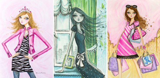
In January 2011, Vogue Mexico and Latinoamerica published a four-page feature on Bella, describing her figures as, "graceful, feminine women with endless legs [and] swan necks," "the ultimate personification of chic." The interview coincided with Bella's work for Vogue Shopping Experience, an all-day charity event that took place in Mexico City's fashion district. Bella's illustrations ran as advertorials in the Mexican editions of Vogue, Glamour and AD Magazine.
Then in February 2011, the Mexican women's magazine Femina interviewed Bella for a full-page article about her career as an illustrator. During the interview, Bella stressed that individual style is what makes artists stand out from other professionals. "It doesn't matter how many other illustrators there are out there looking for the same work. As long as you are true to your individual style, competition is never a thought. How can you compete if you're the only one that does what you do!"

Bella Pilar's love of fashion combined with a sweet whimsical aesthetic make her the go-to girl for the fashionista and girl-next-door alike. To see more of Bella's work, along with behind-the-scenes images of her illustration process, visit her blog at junipervalentine.blogspot.com.

Click here for downloadable items - desktop wallpapers and a high-res printable letter sized promo.

Q&A with Bella Pilar

What's the best part of being an illustrator? I have a great excuse to hang out in coffee shops. I camp out with a latte at a window seat and sketch jobs on the days I am not in my studio painting.

Flight or invisibility? Invisibility.

If you could change one thing about your studio, what would it be? Can we make it bigger please.

What is your go-to karaoke song? Hit Me With Your Best Shot, Pat Benatar.

Your ideal vacation spot? Anywhere with new and interesting foods. It could be a fast paced urban jungle where I'm eating at the best restaurants or the most exotic street vendor foods standing on a busy corner. Or it can be a quiet desolate beach or countryside where I'm eating the local specialties in the peace and quiet. My dream vacation is a food tour of the world. We recently stayed on a farm in Sonoma where we milked the goats and collected eggs from the hen house. That next morning we were eating fried eggs and goat milk yogurt. Pretty ideal.

What do you do when you're not working? Hang out with my kids and husband.

What is one tip you want to share with other creative professionals? I'm practical - buy in bulk. No, seriously. You never want to reach for that watercolor paper or that lead for the pencil, and find that... uh oh, there's no more! And it's 2 am! So all you fellow late night workers, keep a good supply of supplies in your studio.

Why gouache? I find it soothing to paint with. I don't struggle or battle with it. It's quite comfortable and natural for me to express ideas in this medium. And I love the texture you can create since it can be transparent as well at opaque. Great for a good splatter.

Who are three artists you admire? My daughters and my husband. My husband's drive and love for his filmmaking is quite an inspiration. As for my two little girls - I scream with joy over every little art project they do. Each one is it's own little masterpiece. The thing is, is that they see greatness in every piece they create, without hesitation or doubt. They are confident in all of their creations. I admire that.

What are some sites you have bookmarked in your browser? www.epicurious.com Cant cook dinner without it. www.etsy.com I mean, really, so much talent out there. I love to shop here late night when the kids are down. www.illustrationmundo.com It's all there. www.pinterest.com Lots of eye candy.

Your favorite member of the '80's Brat Pack? Molly rules.

You're a born and bred New Yorker. When and why did you decide to move to Los Angeles? I've been in Los Angeles much longer than I had ever planned. We moved here simply for a change of pace, a new experience. But its hard to slow down the pace of this New Yorker, and I basically jet back to NY every free moment I can. I live in LA, but my heart belongs to NY. You can take the girl outta NY, but you cant take the New Yorker outta the girl, isn't that what they say?

In an ideal world, you would have a lifetime supply of...? Chocolate. Rest. Love.

GRAHAM ROUMIEU

GR-Header

Toronto-based illustrator Graham Roumieu's characteristic style, consisting of inked lines and watercolor washes, always accompanies an offbeat and often irreverent sense of humor. Whether it's a bee flirting with a gardenia over a glass of wine, God asking Adam to become his Facebook friend, or a housekeeper vacuuming the tomb where Romeo mourns Juliet, Roumieu's images consistently provoke both thought and laughter.

GR-Magazines

Roumieu regularly works with a number of publications throughout the U.S. and Canada. His clients include the Wall Street Journal, the New York Times, Business Week, and the Washington Post. He has also authored and illustrated six books: Some Really Super Poems About Squirrels (Andrews McMeel), 101 Ways to Kill Your Boss (Plume), Cat & Gnome (Blue Q Books), and the cult classic Bigfoot series - Me Write Book: It Bigfoot Memoir (Plume), Bigfoot: I Not Dead (Plume) and In Me Own Words: the Autobiography of Bigfoot (Manic D Press).

GR-Newspapers1

His most recent publishing project is a creative collaboration with postmodern author Douglas Coupland, titled Highly Inappropriate Tales for Young People (Random House Canada). Coupland, who authored jPod, Life After God and the international bestseller Generation X: Tales for an Accelerated Culture (which popularized the terms 'McJob' and 'Generation X.'), are well matched in their irreverence and love of social commentary. In the book, Roumieu and Coupland combine their talents to create seven hilariously improbable tales, featuring characters like Donald the Incredibly Hostile Juice Box, Hans the Weird Exchange Student, Brandon the Action Figure with Issues, and Kevin the Hobo Minivan with Extremely Low Morals. The highly anticipated book lands in stores October 25, 2011.

GR-Books2Coupland

In 2003, Roumieu published the first in a series of Bigfoot autobiographies. Written from the perspective of a jaded, egomaniacal ex-legend whose hobbies include terrorizing forest critters and composing screenplays, the books have quickly become a cult favorite. Bigfoot's antics have inspired readers to write Bigfoot songs, make Bigfoot dolls, and even bake Bigfoot cakes. The very hairy leading man has thousands of followers on Twitter, where he regular charms fans with sayings like, "Secret to great smile is use Lee Press On Nails as veneers" and "Wearing two sashes and a cummerbund. It just feel right."

GR-Books

Bigfoot's charm stems from a stubbornly juvenile outlook that is by turns abrasive and endearing. In one chapter, Bigfoot admits that his less-than-eloquent speech patterns made him the target of bullying in high school. His confession accompanies a flashback of teenage Bigfoot tearing down the opposition (literally) at a high school debate. A decapitated head lies on the linoleum as two recent amputees cower in a pool of their own blood. Red ink, smeared and spattered throughout the page, vividly relays the relish with which Bigfoot dismembers his competitors.

Roumieu's wildly energetic, and sometimes gleefully gruesome, brushwork sometimes seems at odds with his underdog sensibilities. In a recent interview, he says, "I think I have a tendency to gravitate to subjects that are sweet, naive and innocent in nature because it gives more impact when I inevitably throw them into situations that are bizarre, human and dire." With Bigfoot, Roumieu has combined all of the above, producing a creature whose displays of ego rival only his bouts of crippling insecurity.

Roumieu's 101 Ways to Kill Your Boss has been universally applauded and published in many countries worldwide. Imagine eviscerating your boss with a giant laser pointer, quitting your job via ninja courier service, laying a trap by way of urinal guillotine. Roumieu takes office politics to the next level with increasingly extreme tactics for boss-icide. His illustrations find the bizarre and the funny in even the most mundane office environments. Linked together by a deep yet twisted look into the human psyche, Roumieu's work continually surprises viewers with its insight and its ability to elicit gut-wrenching laughter.

GR-Posters

In addition to illustrating for publications and graphic novels, Roumieu has worked on a number of successful ad campaigns, including "Ink Amnesty" for HP, "Early Bloomers" for Big Brothers Big Sisters of Canada, and "No Peeking Event" for Sears. "Ink Amnesty" for HP featured an out-of-control squid character that warned against using third-party ink cartridges in HP printers. The Big Brothers Big Sisters campaign used Roumieu's humorous peer pressure illustrations to encourage people to mentor a child though the Big Brothers Big Sisters In-School Mentoring program. The "No Peeking Event" for Sears took place in downtown Toronto and featured a 2,200 square foot maze, an electric train, ice sculptures and plenty of free giveaways. The event took place at a major Toronto intersection and went live right before the holiday season. Roumieu's work for the well-publicized campaign was animated and projected on a several-stories-tall screen above the maze.

GR-Advertising

His work has been honored by American Illustration, Communication Arts, Society of Illustrators, Applied Arts, the HOW International Design Awards, the Advertising & Design Club of Canada, the Coupe International Design Competition, the SPD Spots Annual, and the National Magazine Awards. His site Roumieu.com was recently named one of HOW Magazine's Top 10 Sites for Designers. When he's not illustrating, Roumieu teaches at OCAD University, Canada's oldest and largest art and design school.

Click here for downloadable items - desktop wallpapers and a high-res printable letter sized promo.

GR-Newspapers2

Q&A with Graham Roumieu

Best way to end a long day of work?

Satisfied. Waist band full of money. Wait. Wrong job.

Favorite way to spark inspiration?

Sometimes if I am stumped by something I...

If you weren't an illustrator, what would you be?

Probably a gardener. When I was a kid I was obsessed by a show called The Victorian Kitchen Garden which was a BBC series documenting the restoration of a derelict manor house garden, and re learning techniques that resulted in people being able to grow tropical fruit in dreary English conditions.

When I was in college I spent some summers planting trees. Sometimes thousands in a day. That cured me of wanting to garden for a while, but it did eventually come back. It's only been fairly recently that I live in a place that has a back yard where I can mess about with plants and to put it quite simply, I enjoy it quite a bit.

Why do you prefer ink and watercolor over digital media or other forms of traditional media?

It's what I am used to and it best approximates what is in my head. Plus the idea of making something meaningful with a piece of paper and a stick covered in some stuff that stains the paper is pretty awesome. Trying to do the same thing with a machine that can also plot the orbits of spacecraft is pretty awesome too, but in my opinion, somewhat less so.

GR-OnlineCorporateBranding

What's the last book you read?

Hot Art by Joshua Knelman, a mind-blowing investigative book on the world of international art theft.

In your Bigfoot series, the protagonist is a narcissistic megalomaniac with impulse control issues. Is his story inspired by your own life experiences?

No, unlike Bigfoot, I am pretty much perfect.

What is your ideal studio like?

Self-cleaning, well stocked, workshop-like, prone to interesting visitors that bring me lunch and news of the outside world.

Who is the funniest person you know?

Funny 'ha-ha' or funny 'hmmmmm'? Or both? Like that clown I know that is always muttering stuff about the government.

Which fictional character do you most identify with?

Sometimes, C3PO, sometimes, HAL. Sometimes Arthur Dent, sometimes Dave.

When did you decide to become an illustrator?

Aside from going to art school to study illustration, I think I kind of just became one. I do have a vague recollection of originally wanting to be an animator.

What's one tip you want to share with other creative professionals?

If you're moving the pen around and nothing happens it probably means it is out of ink or the cap is still on or you are holding it upside down or you have mistaken a hot dog for a pen.

Also, having the discipline to sit down and work at something until you get it right is a surprisingly rare trait in people, so if you have it, or feel you have the potential to have it, make use of it. Protect it like your life depended on it.

GR-BookCovers


What is your guilty pleasure?

Teleportation.

What do you do when you're not working?

Hang out with friends.

Look out your window. What's the first thing you see?

Darkness. It's night time. My own image reflected back at me. Hey there handsome. See question 6. (Wow! That there was some poetry.)

If Hollywood produced a movie based on your life, which actor would play the leading role?

Best decided by a winner takes all no rules casting call death match.

GR-Newspapers3