Roumieu wins ADC Award

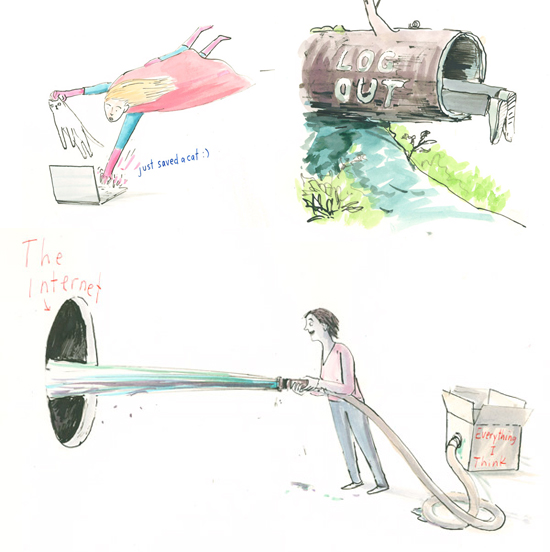
Graham Roumieu's series of illustrations for Real Simple Magazine is a merit winner in this year's ADC competition. The Art Director's Club is the premier organization for integrated media and the first international creative collective of its kind. This year, the jury chair for the illustration entries was Rodrigo Corral, Creative Director at Farrar, Straus and Giroux.

Congratulations Graham!

Haworth for Logitech

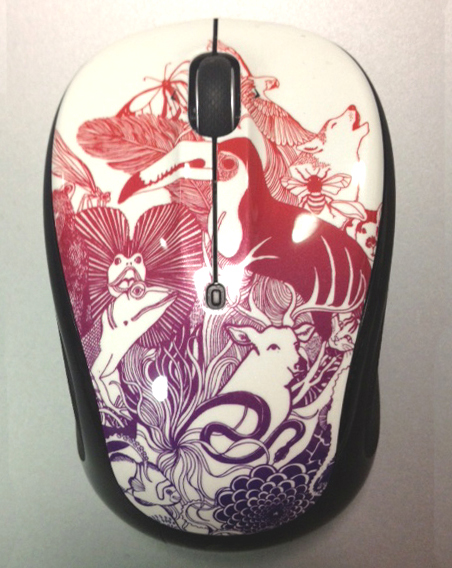
Hennie Haworth's designs will appear on a limited edition wireless mouse for Logitech. The mouse is part of a campaign called the Global Graffiti Collection. Emerging designers like Hennie Haworth were sourced from around the world for a single collection with global appeal.

Grosch for Land of Nod

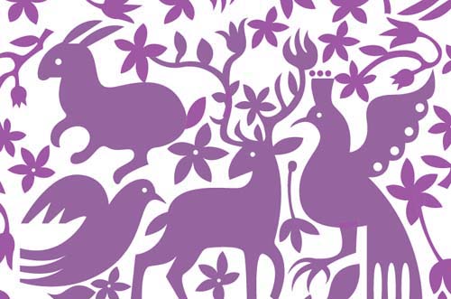
Eleanor Grosch's artwork can be seen on a line of children's bedding from Land of Nod. The line, Animáles Grafico, is available in three colors — teal, lavender and yellow — and is inspired by the traditional patterns of the Otomi people, an Indigenous group from central Mexico. Adorned with animals of all shapes and sizes, this beautiful bedding is rich in both design and tradition.

LandOfNod

Pilar for Ashinaga Charity

Bella Pilar will be participating in the Shadow Box Art Exhibition at the Tokyo International Forum. Japanese shadow box artists Hiroe Otani and Ms. Ohashi created the art using Bella's glittery cocktail girls - Mai Tai Girl, Margarita Girl, Pina Colada Girl, and Strawberry Daiquiri Girl.

The exhibit will include over 200 shadow box artists from all over Japan, and 100% of the proceeds will benefit the Ashinaga Charity, which helps children who lost parents in the Tohoku area Pacific Earthquake and Tsunami.

ELEANOR GROSCH

Eleanor Grosch's playful arrangements of line and form are sleek, minimalistic experiments in geometry. Whether it's an arched beak, a meandering tail, or the sleek lines of a bicycle, Eleanor's illustrations rely on sparsely articulated lines to convey shape and motion. Her understated colors complement the subtlety of her forms and soften her sleek geometric compositions. Well-known for her unique modernist perspective on the feathered, the furry, and the scaly, Eleanor brings a designer edge and distinct mid-century aesthetic to all of her artwork.
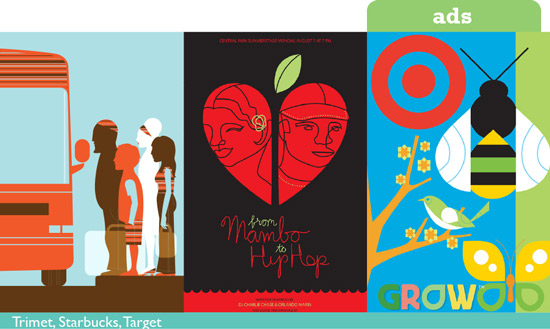
Eleanor draws inspiration from sources as diverse as the Spanish abstract painter Joan Miro and modernist illustrator Charley Harper. In 2010, Harper's estate asked Eleanor to redesign charleyharperprints.com. Eleanor's prints have even appeared on the site alongside Harper's work and that of Harper's descendants Edie and Brett Harper.

Eleanor was named one of Print Magazine's New Visual Artists of 2008. The New Visual Artist Review introduces and profiles thirty of the most promising rising talents in graphic design, advertising, illustration, digital media, photography and animation - all under the age of thirty. The competition is by invitation only with entrants being nominated by art directors, designers, critics and industry professionals. In the article, Emily Gordon writes, "Grosch walks a cheerfully nonchalant line between cute and cool, using [...] a menagerie of whimsical imagery."

Always the 'class artist,' Eleanor began developing her style, and a fascination for animals, in her early teens. "I'd draw during class and then more when I got home," she remembers. One thing that hasn't always been constant has been her confidence in pursuing art as a profession. In an interview with Philadelphia Magazine, Eleanor recalls hearing a professor say, "'In five years, only one person in this room will be making a living doing art." As a fledgling art student, Eleanor remembers thinking, 'It's not going to be me.' She jokes that, "My big goal was, 'I hope one day I get a chance to make something for someone for free.'" Since then, Eleanor has learned that a confidence in your work is essential. "You have to have good self-esteem about your work. Assuming someone's going to like you is a good start."
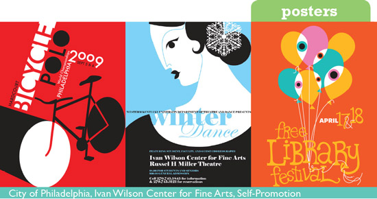
Shortly after graduating from art school, Eleanor landed her first gig illustrating and designing a poster for the Orpheum in Tampa, Florida. "I used to dance there, and I remember seeing my poster up for the first time!," she says "What a thrill!!" The design was for the first of many band posters, the sum of which ultimately caught the attention of an editor at Nylon Magazine. Since then, her work has appeared in magazines, books, products and packaging, as well as in corporate advertising campaigns. Eleanor has worked with clients such as Keds, The San Diego Zoo, Oxfam, Starbucks, Chronicle Books, Land of Nod, Urban Outfitters, and Shutterfly.

Eleanor's first experience with licensing was when Keds launched a line of her shoes in 2006. Modeled in print ads by Mischa Barton, known for her role on the TV series The OC, the shoes flew off the shelves and Eleanor Grosch as an art brand had arrived with a splash. Since then, her work has appeared on a variety of licensed products, from Giro helmets and Alien Workshop snowboards, to wall art for Muralstick and stationery for Marian Heath and Tiny Prints. Her gulf-inspired luggage tags for Zehno also appeared in Print Magazine's 2011 Regional Design Annual. Sale of Eleanor's tags benefitted the Coalition to Restore Coastal Louisiana, a non-profit organization that advocates for Louisiana's wetlands.

Marian Heath recently released a line of nine glitter-embellished greeting cards featuring Eleanor's artwork, which they describe as featuring her "smart, hip aesthetic and trademark graphic style." Her feathered friends are on trend in the UK as well, with seagulls and skimmers appearing on Printermakers cards by the publisher Art Angels. The biggest volume of card designs can be found at Tiny Prints with dozens of print-on-demand custom stationery and card products.

In addition to her work as an illustrator, Eleanor also runs Pushmepullyou Design, an online shop selling art prints, t-shirts, accessories, and housewares. Inspired by Dr. Dolittle's two-headed llama, the name 'Pushmepullyou' captures Eleanor's love of animals and her whimsical sense of humor. For all things Eleanor, from greeting cards and magnets to wallets and tote bags, visit http://www.merchline.com/pushmepullyou/.
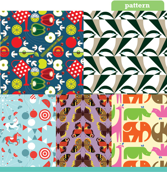
Eleanor's work has also been featured in Grain Edit, Design*Sponge, Philadelphia Style, Philly Mag, NYLON Magazine, and The Art of Modern Rock. Eleanor has been a guest speaker at the 2010 HOW Design Conference and at Dallas AIGA. Eleanor is also a recipient of the PETA Libby Award, which is awarded for the quality of animal-friendly products as well as the nominee's enthusiasm for animals.

Wherever she looks, Eleanor is drawn to clean lines and striking colors. To see more of her work, visit www.justeleanor.com.

Click here for downloadable items - desktop wallpapers and a high-res printable letter sized promo.

Q&A with Eleanor Grosch

Use three words to describe your style. Simple, bold, colorful

What is a typical work day like for you? How do you portion off your time? I usually start at 8 with a nice breakfast and then get right to it; I find I'm most productive in the morning. Then I gotta move around a bit so I clean the house for about 30 minutes or go to the gym. Afternoons I usually need a break also, so I watch some TV for another 40 minutes or so in-between working. I try to stop at 5PM these days, but I find that I'll often draw something in the evening.

A genie grants you three wishes. What do you wish for? Probably a quick-travel system of some sort, slightly longer hotter legs, and a never-ending income stream for my Mom so she could retire right away.

What is your ideal assignment? Anything where I get a solid concept. I love the challenge of conceptual thinking. You're dressed like a mime on the front page of your website. What's the story behind that? That came from a fun photo shoot with my friend, photographer Brae Howard. I think I've always loved mime makeup, so we went for a couple of shots with that look and it turned out to be my favorite photo. Plus, it makes me look fun, which I think I am most of the time!

What's the best way to get over a creative block? Do something completely unrelated - take a bike ride, do something physical. It usually straightens me out really well.

What's one tip you have for other creative professionals? Never, ever, stop making your work. Someone will like it eventually! I think the people who "make it" are those with staying power.

What is your favorite part of living and working in Philadelphia? I love the small, cute scale of the city. It's bike-able and walkable and has lots of the cool things that NYC has but in a cheaper and less tiring way. I'm just not cut out for a place like NYC, so it's nice to live in a city where there's a slower pace.

If you were reincarnated as an animal, which animal would you be? Definitely a flightless bird. Probably an ostrich - big legs, long neck, fidgety. I've even been dressing like a female bird more and more lately: beige, gray, brown - dull colors for safety.

Do you have a favorite movie? For the past 10 years, it's been The Fugitve. We'll see if something tops that...

I hear that you're also a trapeze artist. How did you get started? Is it hard to balance your passion for trapeze with your illustration career? N/A - I quit since I was so awful at it!

What are some sites you have bookmarked in your browser? I love my brother's blog: www.lifeisrealgood.com - he's biking around SE Asia right now. Sounds very cool but very tiring and difficult. I love his writing style; it's super funny with short sentences. Also, catalog-choice, an opt-out service for those annoying catalogs companies keep sending us all.

Do you listen to music while you work? What's the best and worst type of music for getting things done? No, I usually watch TV or have silence. Music, for me, is better for home-repair jobs. Sundays I get my little groove on to R&B while I'm painting or fixing or cleaning. So fun!

If you could be anything besides an illustrator, what would you be? I would love to be a smart computer person or someone who does hard physical labor part time. Or maybe a house cleaner? I'm really good at cleaning.

What is your ideal studio like? It's my couch!

Magnet Artists for American Illustration 31

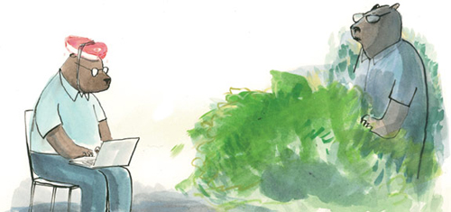
Graham Roumieu’s humorous editorial series has been chosen as a winner in this year's American Illustration competition. This year, 439 images were chosen from 8,000 illustrations submitted by over 1,200 illustrators, magazines, agencies, publishers and schools.  The distinguished jury included Jen Bekman, 20x20; Steven Charny, Rolling Stone; Mia Song, Men's Health; John Gall, Random House; Aviva Michaelov, The New York Times; Veronica Reo, Young & Rubicam; and Paul Sahre, O.O.P.S. Congratulations!
GR-Real-Simple.jpg

Graham Roumieu, "Social Media Habits" series, Real Simple Magazine


Roumieu for PEN Canada

Graham Roumieu illustrated a promotion for a PEN Canada lecture at the Royal Ontario Museum. The event takes place Thursday, May 17 at 7:00 PM and promises to be a lively and provocative discussion of satire: "Legendary New Yorker writer Calvin Trillin and comedian, actor and author Seán Cullen discuss comedy, satire, and the legacy of Canada's great novelist and provocateur [Mordecai Richler]."


Grosch for Art Angels

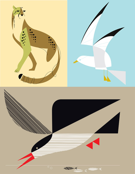
Eleanor Grosch has released a line of three cards - Shallows, Wild Cheetah and Gull - with UK-based stationery company, Art Angels. The cards are part of the Printmakers series, which uses art from original artist screenprints. They are sold in packages of six and include buff-colored envelopes.

Graham Roumieu Win SPD Awards

Graham Roumieu was honored as a merit winner in the 2012 Society of Publication Designers Awards.

Graham Roumieu's piece, Data Hog, for Bloomberg Businessweek ran alongside the article Wireless: Overstating Smartphone Data Hogs? which discusses how smartphone power users may not be the problem the wireless industry would have you believe.

GR-DataHogs
GR-DataHogs

Graham Roumieu's "Data Hogs" for Bloomberg Businessweek. Brendan Greeley (writer), Richard Turley (creative director), Cindy Hoffman (design director) and Maayan Pearl (art director).

Pilar for The Art Group

Bella Pilar's square format greeting cards for the Art Group have been released in the Netherlands. The series of 9 features everything from birthdays, baby showers, and everyday. The cards are beautifully embellished with glitter, giving the images a lovely texture and sparkle.

Roumieu for the Globe and Mail

Graham Roumieu's most recent bi-monthly contribution to the Globe and Mail's Focus section has been published.  Titled "Seal Team Six: What are a President's Ultra-Classified Friends For?," the illustration imagines zany presidential applications for a highly trained group of Navy SEALS.

HENNIE HAWORTH

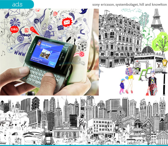
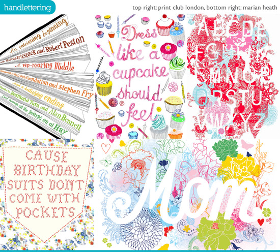
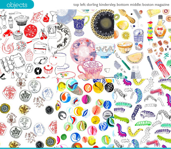
Intricately drawn details and a light, mixed-media aesthetic are what make Hennie Haworth's work engaging, eccentric, and inventive. Hennie's hand-drawn lines give her work a charmingly irregularity, while her judicious use of decorative elements imbue her art with a sense of whimsy. Whether it's a Tokyo street or a Parisian boulevard, Hennie's eye for color, texture, and architectural detail lends a rich and intricate character to her scenes and cityscapes. Her handlettering has a similarly lavish quality, with letters swooping into languid patterns that are at times loose and naive, and at other times delicate and sophisticated.

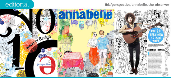
Hennie's work has appeared in books, newspapers, magazines, ad campaigns, packaging, on products and more. She has worked with clients as diverse as Bloomberg Business Week, Penguin Books, BBDO (South Africa), Samsonite (Japan), and Urban Outfitters (UK). Hennie's work has also been honored by the Society of Illustrators in New York.

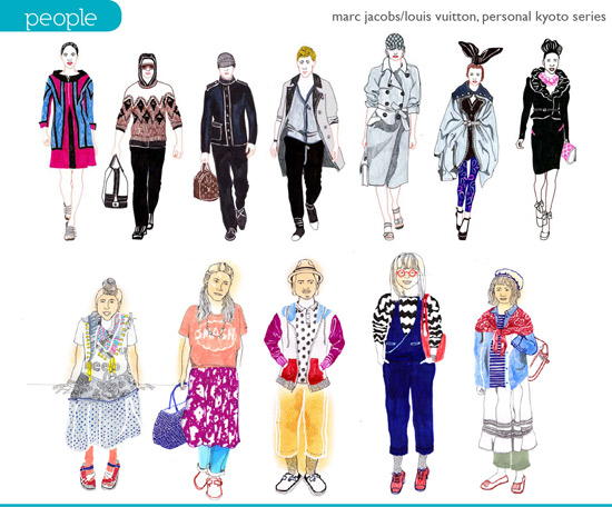
Her latest project has been a series of illustrations for the partnership between Marc Jacobs and Louis Vuitton. Hennie's artwork features stylish 'head to toe' portraits set in the fashion capitals of New York and Paris. The illustrations were integrated into Marc Jacobs's profile on the Louis Vuitton website.

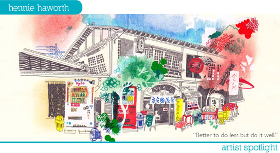
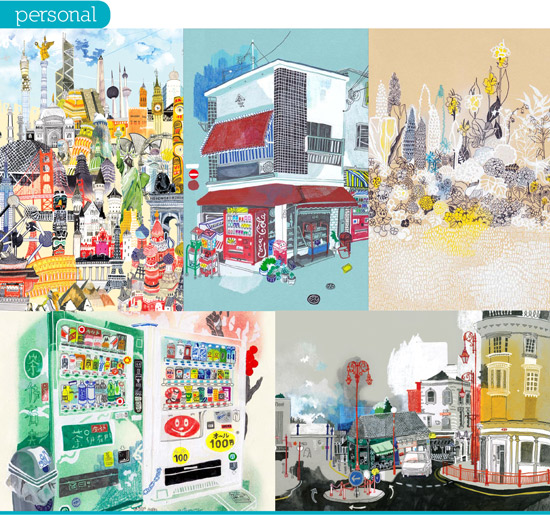
Currently based in East London, Hennie loves the city but has also been influenced by her travels through Japan. Her series of Tokyo vending machines captures the condensed spaces and unique color schemes of urban Japan. She has worked on a number of creative collaborations with Japanese companies and organizations. In 2011, Hennie participated in a project called 'One Thousand Cranes' for Japan. She contributed patterned designs to the organization, which used the origami theme to benefit the Japan Earthquake and Tsunami Relief Fund. The project draws upon the Japanese belief that folding one thousand cranes will allow you to make one wish come true.

A series of Japanese vending machines and portraits of Kyoto people are two personal projects that sprang from Hennie's travels through Japan in 2010. Hennie believes that "personal projects are very important and are often the work you're most proud of." She uses personal projects as a way of developing her skill set and experimenting with new techniques. Her portraits of Kyoto's citizens explores fashion through the lens of Japanese youth culture. As Hennie meticulously details her subjects' patterned tights and bunched up sweaters, she demonstrates her eye for detail. Hennie's fascination with detail is one of her biggest strengths, but it also means that sometimes she tells herself that "it's better to do less but do it well." When working, Hennie always tries to balance the depth of detail with the charm of simplicity.

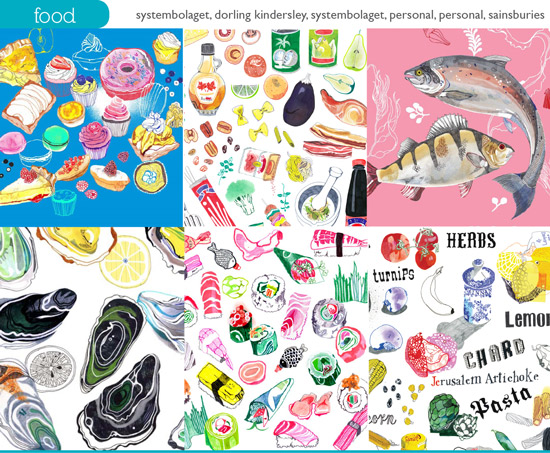
Clients from a growing list of countries have assigned work to Hennie, from South Korea to Sweden to China, the UK, Germany, Japan, South Africa, and Italy. She has worked with South Korea's Hyundai Department Stores, and Systembolaget, a Swedish chain of wine and spirits retailers. Hennie's handlettering has also appeared on packaging for the eponymous UK supermarket chain Waitrose, which commissioned illustrations for an exclusive line of holiday treats.

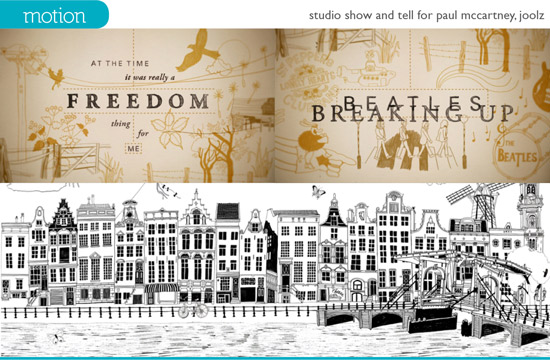
She has recently worked on motion projects, creating content for animated broadcast and online ads. Her work set the backdrop for a moving image spot by Joolz, an Amsterdam-based baby stroller company. These black and white line drawings were later reproduced as a wall mural in a Joolz retail store. Hennie's animated trailer for Paul McCartney's latest release, The Album Story, was recently featured at the London Short Festival. Produced with the help of talented Ali Assaf and Rob Tovey of the London-based Studio Show & Tell, Hennie's illustrations and handlettered titles evoke the nostalgic and melodic qualities of McCartney's music.

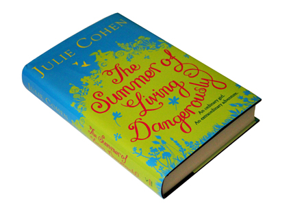
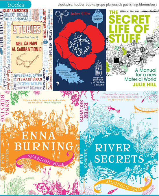
Hennie has also illustrated several book covers, including Michael Pollan's In Defense of Food (Penguin), Julie Cohen's The Summer of Living Dangerously (Headline Review), Alberto Ferrars's B as in Beauty (Random House), Karen Phillips's The Truth About My Name (Klutz), Andrea Gillies's Las Amapolas del Olvido (Grupo Planeta), and How to Cook: Delicious Dishes You'll Really Want to Make (Dorling Kinsey). Hennie's cover for Klutz's The Truth About My Name features dozens of handlettered names, stylized to resemble the names scribbled into schoolgirl notebooks. The book includes a variety of games and quizzes that help girls find the hidden meanings behind their first names. Her series of covers for Shannon Hale's Books of Bayern series (Bloomsbury) feature decorative elements that evoke the aquatic and the fiery elements of each plotline. The Goose Girl, River Secrets, Book of a Thousand Days, and Enna Burning are available through Amazon and Bloomsbury.

Having a dual talent for illustration and handlettering have made Hennie Haworth an invaluable collaborator for a long and diverse list of clients. To see her latest work, visit her Magnet Reps portfolio or her personal website at henniehaworth.co.uk.

Click here for downloadable items - desktop wallpapers and a high-res printable letter sized promo.

Q&A with Hennie Haworth

What do you do when you have a creative block? What are your best sources of inspiration? I find exercise is a great way to get past it. Taking a break, getting some air, and coming back to it later with fresh eyes really helps. I'll just think about something completely different for a while, and that normally gets me going again.

I think inspiration can be everywhere you look, it's just a case of being open minded.

What are some sites you have bookmarked in your browser? I love having a look at Print & Pattern (http://printpattern.blogspot.com/) and Design Sponge (http://www.designsponge.com/).

What's the last movie you saw and how did you like it? Bridget Jones! But it was just on over Christmas. The last film I watched at the cinema was a Buster Keaton one called The General. It's an old silent movie, and they had someone playing the piano live along to it which was really great. It's really funny and the stunts he does are so clever - and dangerous when you think how long ago it was made, before special effects and all that stuff.

What is your biggest challenge as an illustrator? There are lots! One thing I always have to remind myself is to keep things simple. I easily get carried away and clutter the page up if I'm not careful.

What is a typical work day like for you? How do you portion off your time? I get up around 7 and try to go for a run. Then I come back and have breakfast, and a nice strong coffee! After that I'll reply to all my emails, and then I start work on whichever project I'm doing. I find you have to be very flexible with your time as an illustrator. I always take a break for lunch, but the time I finish always varies - sometimes late into the night.

Do you listen to music while you work? What's the best and worst type of music for getting things done? I don't really listen to music while I work, mostly I listen to Radio 4 which is all talking. The funny thing is that when I look at my drawings I can remember all the programmes I listened to.

How has your work changed since you've become an illustrator? How do you see your work progressing in the future? Working for other people has taught me a lot about what works and what doesn't. Having feedback from so many different art directors and designers on separate projects has been really beneficial. They'll often suggest things I'd never thought of doing and it's nice to be surprised when it all comes together.

In the future I want to make more time to do my own projects. It's always a struggle but it's really satisfying when something is all yours right through from the idea to the production.

If you could be anything besides an illustrator, what would you be? Ooh there are lots of things, and I'm not sure how realistic a lot of them are, but I'd love to be a spy!

What is your ideal studio like? Nice big windows and lots of friends working there too. I love being able to stop work for a break and catch up on all the studio gossip over a cup of tea!

What is one tip you have for other creative professionals? Make sure you're happy with how things are going - never get trapped into feeling like you're stuck doing things you're not interested in.

You studied illustration at Brighton University. How did a formal arts education shape your style and method of working? I'm not sure. I guess I didn't really know that illustration was something you could do professionally, when I started at Brighton - I just liked drawing. It was only while I was there that I saw what people did and realized I could too. So maybe I'd just be still doing it as a hobby.

What's the best way to continue improving your skills as an illustrator? (Sketching, interacting with other artists, etc.) All of that, and lots more. I wouldn't know what the best way was, but there are certainly lots of good ways. Those two that you've mentioned, as well as trying new things, learning about all the things your materials can do - including the computer, listen to other people's advice and try it out. I just try to make sure that I always look for what I find interesting; I think that helps me develop and not get stuck in any one way of working.

You currently live and work in London. Is the big city conducive to your creative process? What's the difference between working in London and working in Brighton? Living in London has certainly made me aware of how much amazing work is being done all the time by so many brilliant people. Both types places have their good and bad points. Brighton is much smaller so it's easier to feel like you're part of a community which can be very supportive, but London has so much more diversity and things happen much quicker. A bit of both would be nice!

A genie grants you three wishes. What do you wish for? 1. A brand new computer with a HUGE screen. 2. A studio in New York overlooking a nice park. 3. An illustration project that needed me to travel the world.